THE FAROE ISLANDS SPACE PROGRAM
Brand
SKF
Entrant Agency
NORD
Category
Design
Award
Grand Prix
Festival & Year
Cannes Lions (2026)
Presentation Board
SKF REBRAND LAUNCH CAMPAIGN
FAROE
InLANDS
2826 FAROE ISLAI
a)
PROGR
BACKGROUND
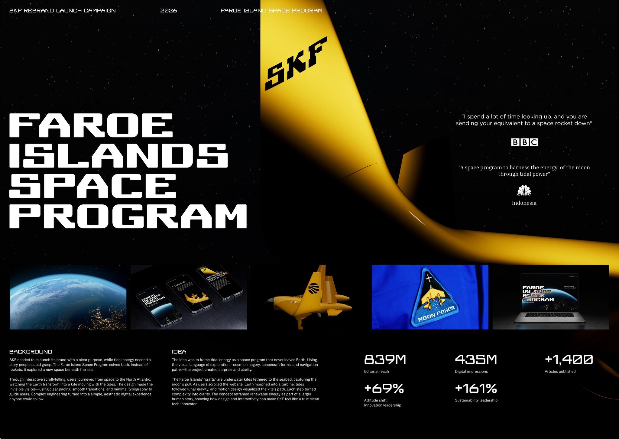
SKF needed to relaunch its brand with a clear purpose, while tidal energy needed a
story people could grasp. The Faroe Island Space Program solved both. instead of
rockets, it explored a new space beneath the sea,
Through interactive scrollytelling, users journeyed from space to the North Atlantic,
watching the Earth transform into a kite moving with the tides. The design made the
invisible visible—using clear pacing, smooth transitions, and minimal typography to
guide users. Complex engineering turned into a simple, aesthetic digital experience
anyone could follow.
IDEA
‘The idea was to frame tidal energy as a space program that never leaves Earth. Using
the visual language of exploration—cosmic imagery, spacecraft forms, and navigation
paths—the project created surprise and clarity.
‘The Faroe Islands’ “crafts” are underwater kites tethered to the seabed, capturing the
‘moon's pull. As users scrolled the website, Earth morphed into a turbine, tides
followed lunar gravity, and motion design visualized the kite’s path. Each step tumed
complexity into clarity. The concept reframed renewable energy as part of a larger
human story, showing how design and interactivity can make SKF feel like a true clean
tech innovator.
839M
Editorial reach
+69%
Attitude shift:
Innovation leadership
, "| spend a lot of time looking up, and you are
sending your equivalent to a space rocket down”
“A space program to harness the energy of the moon
through tidal power”
zi
435M
Digital impressions
+161%
Sustainability leadership
+1,.400
Articles published