LOOK FAMILIAR?
Brand
HEINZ KETCHUP
Entrant Agency
RETHINK
Category
Print & Publishing
Award
Bronze
Festival & Year
Cannes Lions (2026)
Case Study Details
LOOK FAMILIAR - Heinz Ketchup - Rethink (Toronto, Canada) - CANNES LIONS 2026
Presentation Board
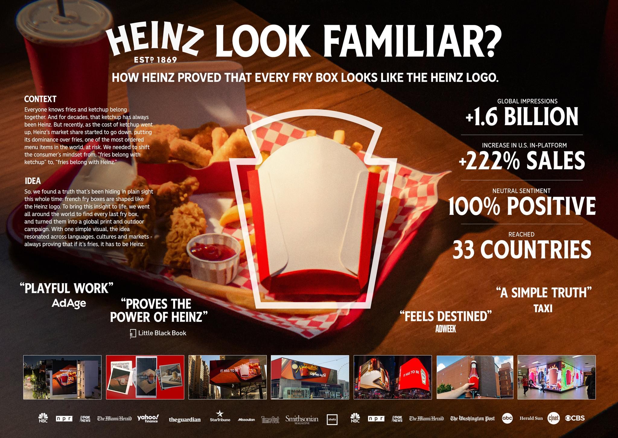
WEINZ LOOK FAMILIAR?
EST? 1869
HOW HEINZ PROVED THAT EVERY FRY BOX LOOKS LIKE THE HEINZ LOGO.
CONTEXT GLOBAL IMPRESSIONS
Everyone knows fries and ketchup belong ="
together. And for decades, that ketchup has always _ +
i e
been Heinz. But recently, as the cost of ketchup we
up, Heinz’s market share started to go down, dint e =
its dominance over fries, one of the most ordered © be
menu items in the world, at risk. We needed'to shift
the consumer's mindset from, “fries belong with
ketchup” to, “fries belong with Heinz.» .
INCREASE IN U.S. IN-PLATFORM
+222% SALES
100% POSITIVE
REACHED
33 COUNTRIES
“A SIMPLE TRUTH”
TAXI
IDEA ma Pa.
So, we found a truth that’s been hiding plain sight ,
this whole time: french fry boxes are shaped like v
the Heinz logo. To bring this insight to life, we went
all around the world to find every last fry box, i
and turned them into a global print and outdoor
campaign. With one simple visual, the idea
resonated across languages, cultures and markets -
always proving that if it's fries, it has to be Heinz.
“PLAYFUL WORK” ;,
AdAge “PROVES THE ~~“
POWER OF HEINZ”
b | Little Black Book
“FEELS DESTINED”
5
Me EMA EK Aheamiziead yohoo! — gheguardian ae osouion gion Smit
a MES CheBianitieald Che ashington Post YP Herald sun @ @cBs