THE GRIT & THE GLITTER
Brand
LONDON MUSEUM
Entrant Agency
UNCOMMON CREATIVE STUDIO
Category
Design
Award
Bronze
Festival & Year
Cannes Lions (2026)
Case Study Details
London Museum - The Grit & The Glitter (Case Study) | Campaign
1. Background
As part of its historic relocation to Smithfield, the iconic London Museum enlisted us to craft a dynamic and resonant new brand identity. This vision was rooted in its storied past as a cultural institution while embracing the future, with a logo designed to encapsulate the dualities of one of the world’s great capital cities.
The London Museum aspires to be more than a museum - it’s a promise to tell each and everybody’s story from a city that houses 9 million people, from every corner of life, through the 10,000 years of history, loves-lost, arguments, trade routes and memories. Our challenge was to move beyond a simple redesign and translate this ambition into a visual language reflective of the city’s vibrant diversity and ever-changing beauty.
2. Creative Idea - A NEW ICON FOR LONDON
For centuries, cities and institutions have used animals as symbols: the City of London’s dragons, the heraldic beasts of the Livery Companies, Lloyds’ black horse. We asked: what creature truly belongs to modern London?
The answer was obvious and controversial. The pigeon. A resilient, impartial observer of city life. Loved by some, loathed by others. Found everywhere, owned by no one. From the rooftops of St Paul’s to the alleyways of Soho, pigeons see everything. They are born of grit and dance in the glitter.
There are an estimated three million pigeons that call London home - that’s roughly one for every three people. You can’t walk around the city without seeing one. But not only that they have been represented throughout the museum’s collection from Roman figurines to Victorian Valentine’s cards, this is a bird that continues to hold cultural weight: from their rising online fan club to finding their way into music, fashion and art.
Credits:
- Client: London Museum
- Agency: Uncommon Creative Studio / London
Presentation Board
“AN UNLIKELY ICON.”
“DARING NEW BRAND
IDENTITY THAT'S AS
POLARISING AS THE CITY
IT REPRESENTS.”
[MOMENT]
“ANEW LOGO THAT
HAS LEFT LONDONERS
ANDTHE INTERNET
BUZZING.”
ARTLOOP
“A RADICAL DEPARTURE
FROM TYPICALLY
STUFFY MUSEUM
BRANDING.”
Gi caeanvesioa
“PEOPLE WELCOMED
A DESIGN VERSION OF
LONDON THAT AVOIDED.
THE TWEE CLICHES.”
DESIGN
‘WEEK
“PEOPLE WILL COME TO
RECOGNISE THE PIGEON
AND SPLAT AS SIGNIFIERS
OF LONDON MUSEUM.”
M Bissciation
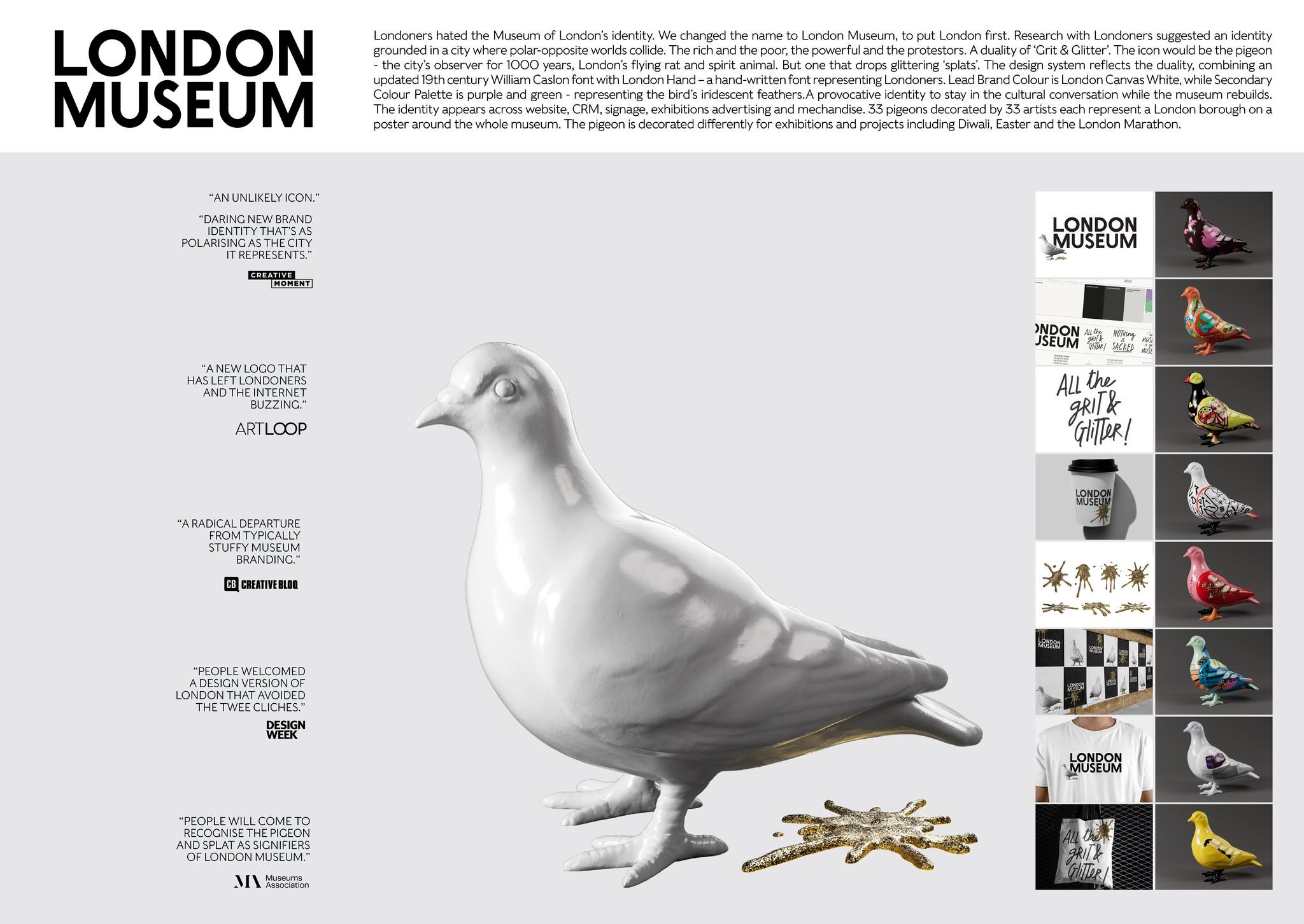
Londoners hated the Museum of London's identity. We changed the name to London Museum, to put London first. Research with Londoners suggested an identity
grounded in a city where polar-opposite worlds collide. The rich and the poor, the powerful and the protestors. A duality of ‘Crit & Glitter’. The icon would be the pigeon
- the city’s observer for 1OOO years, London's flying rat and spirit animal. But one that drops glittering ‘splats. The design system reflects the duality, combining an
updated 19th century William Caslon font with London Hand - a hand-written font representing Londoners. Lead Brand Colour is London Canvas White, while Secondary
Colour Palette is purple and green - representing the bird's iridescent feathers.A provocative identity to stay in the cultural conversation while the museum rebuilds.
The identity appears across website, CRM, signage, exhibitions advertising and mechandise. 33 pigeons decorated by 33 artists each represent a London borough on a
poster around the whole museum. The pigeon is decorated differently for exhibitions and projects including Diwali, Easter and the London Marathon.
YNDON 42 won a
JSEUM ih) sian