Welcome to the automated Brand Tracker diaries.
TDC73 Opens Applications with Revised Categories and Visual Identity Inspired by Indonesian Labels
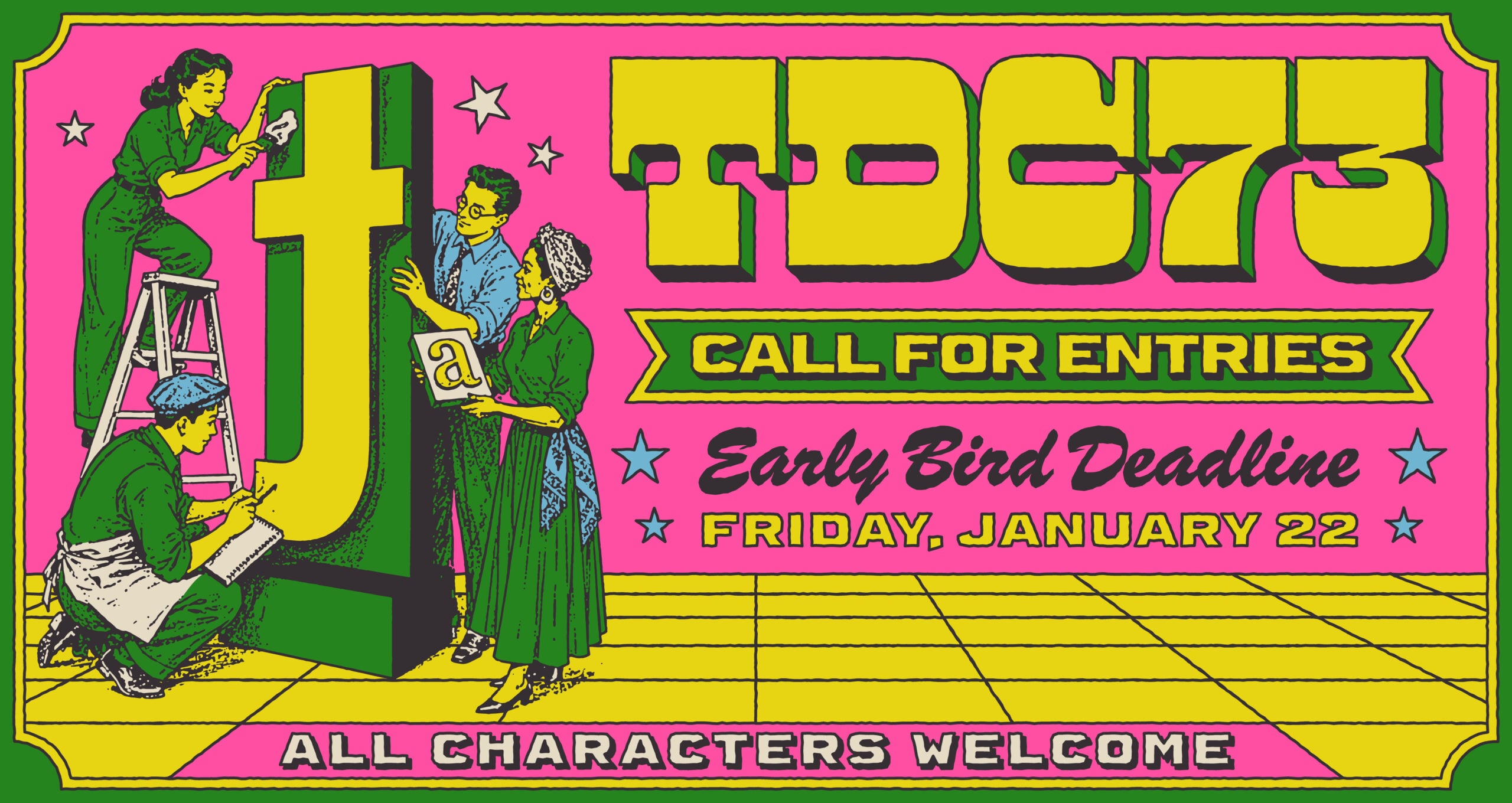
Goal: Encourage designers to participate in the global typographic competition
Claim: Be Bold, Be Seen (All Characters Welcome)
Media: Digital and physical submissions
Summary: The Type Directors Club (TDC) has launched a global typographic competition with a new visual identity inspired by Indonesian labels and packaging. The campaign 'Be Bold, Be Seen (All Characters Welcome)' aims to present diverse typographic expressions and encourage participants to submit works in redefined categories related to communication design, lettering, and type design. The competition invites entries from over 60 countries, with early submission deadlines in January 2027.
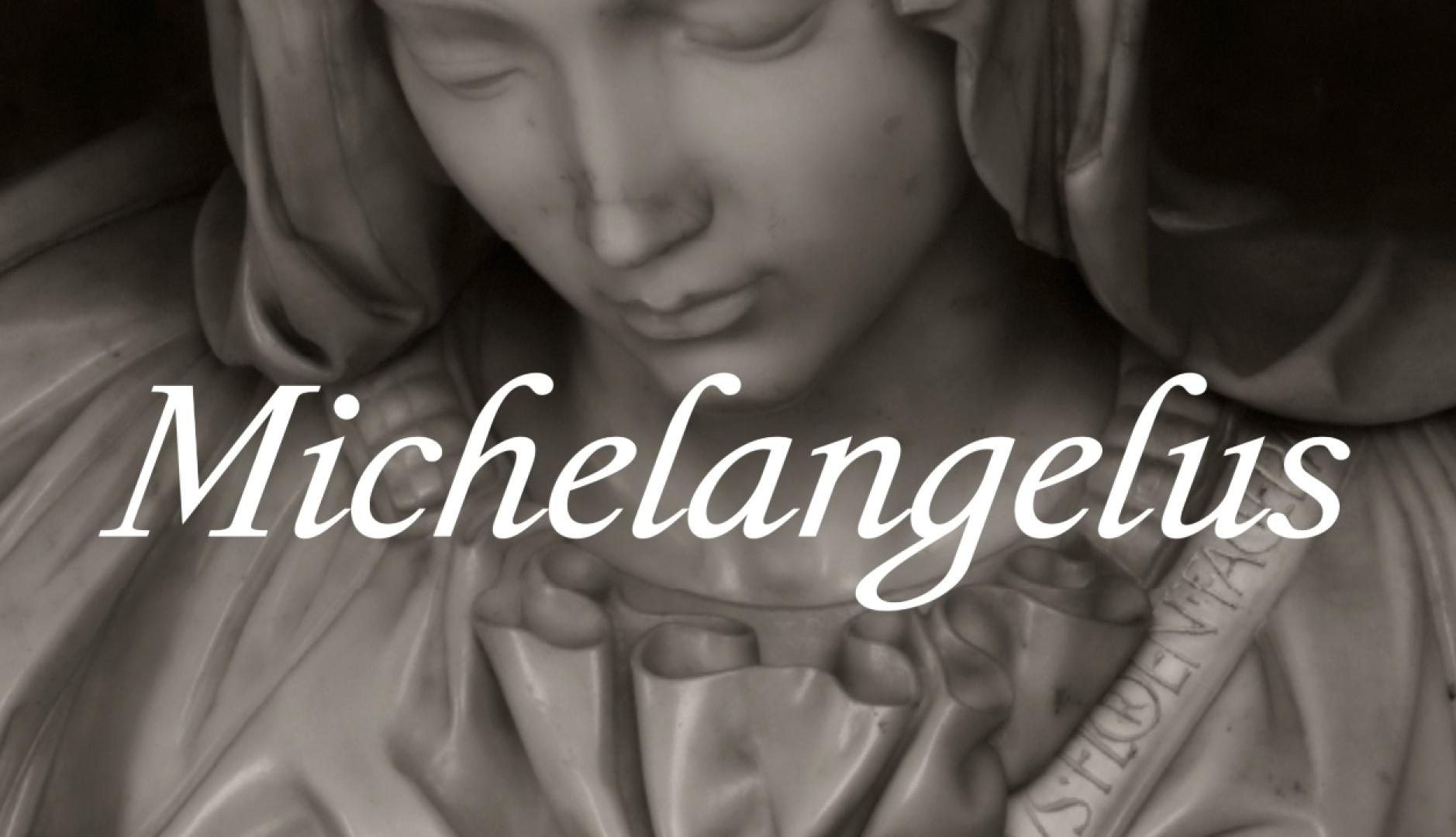
Microsoft creates Michelangelus, a typeface inspired by Michelangelo
Source: https://www.reasonwhy.es/actualidad/microsoft-tipografia-miguel-angel-escritura-obras
Goal: To foster a culture of risk in marketing.
Summary: Microsoft has created a new typeface called Michelangelus, inspired by the works of Michelangelo. The initiative emphasizes the importance of fostering a culture of risk within marketing to discover better ways to improve.
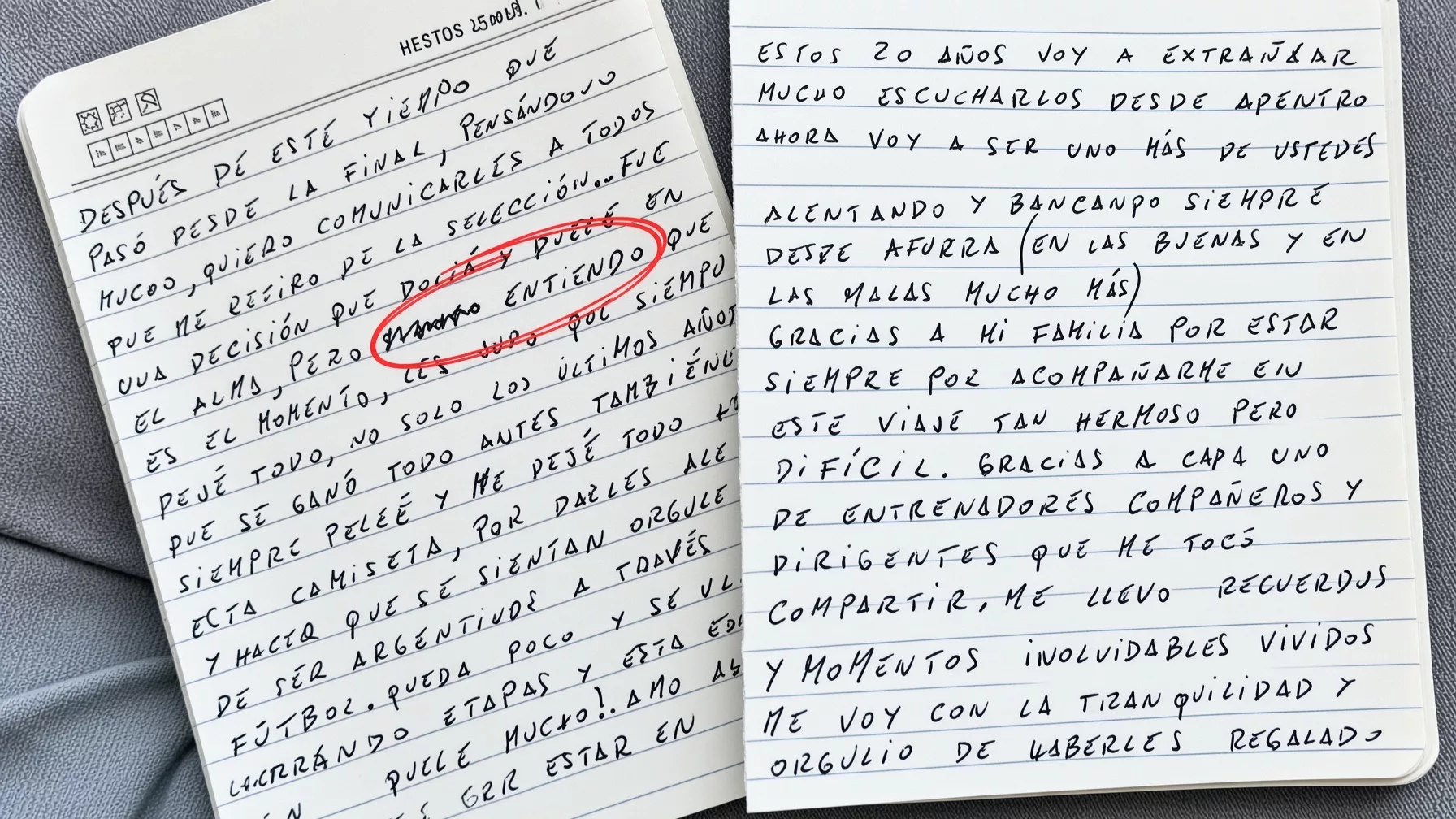
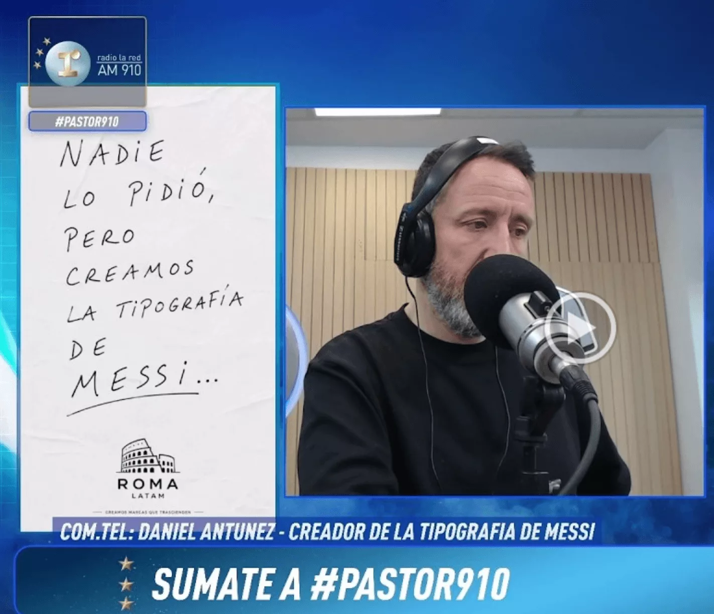
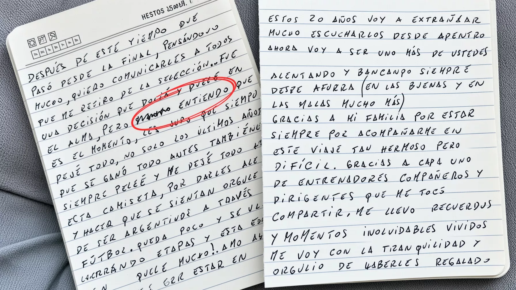
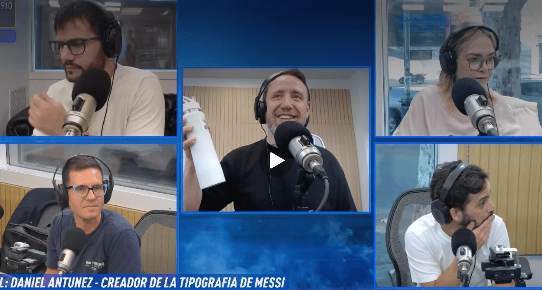
Messi, a letter (that became famous worldwide) and a typography: the idea of RomaLatam that reached the media
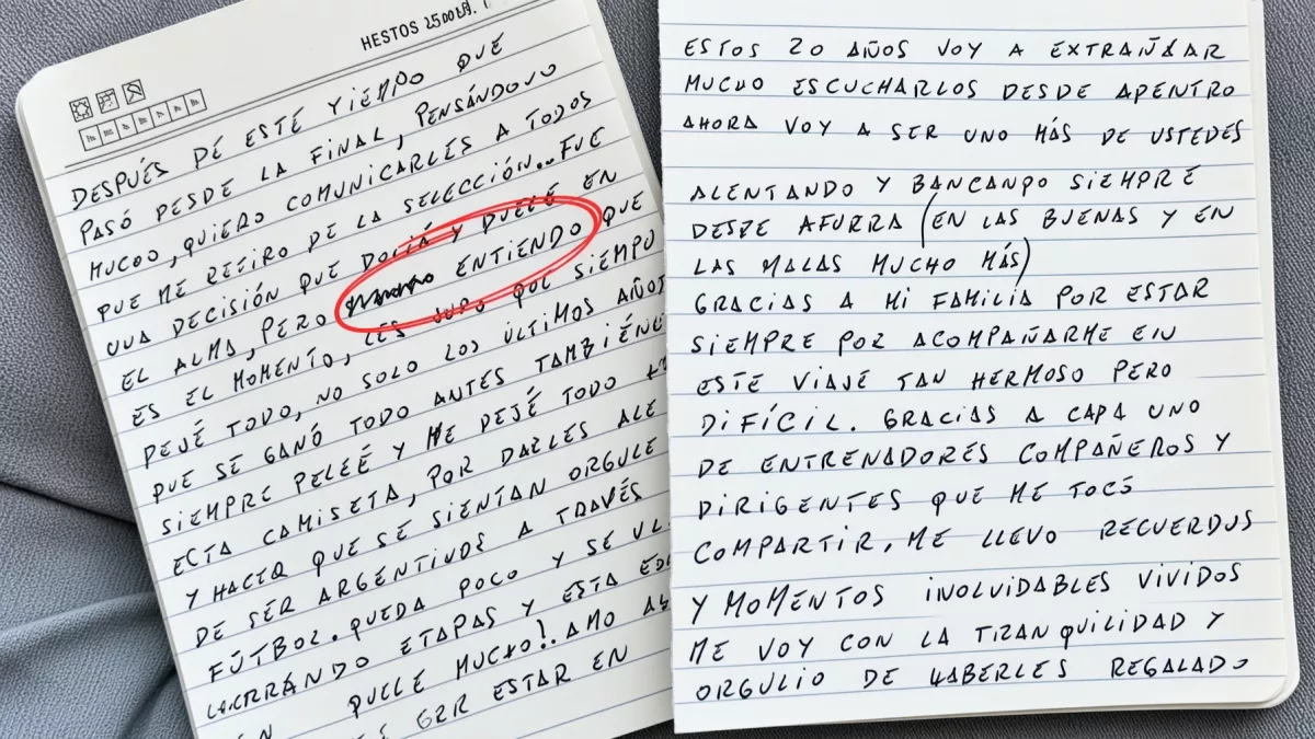
Goal: To create a digital typography based on Messi's handwriting for public use
Claim: Transforming Messi's handwritten letter into a usable digital typography
Media: Radio La Red, Radio LITERAL, online platforms
Summary: RomaLatam transformed Messi's handwritten letter, related to his retirement from the Argentine national team, into a digital typography that anyone can try and download. The initiative gained media attention and reflects RomaLatam's shift towards incorporating AI and new digital products into their strategy.
Instagram Updates Wordmark for the First Time in Ten Years

Source: https://www.imagensdemarca.pt/artigo/instagram-renova-o-wordmark-pela-primeira-vez-em-dez-anos/
Goal: Modernize the brand's visual identity
Media: Social media, mobile application, marketing materials
Summary: Instagram has updated its wordmark for the first time in ten years to modernize its visual identity while maintaining recognizable elements. The new design combines cursive writing with conventional typography, resulting in a more compact and visually striking wordmark. The platform is also reducing its dependence on traditional gradients and creating a visual language that highlights community-generated content. The updated wordmark will be gradually rolled out globally through 2026 and beyond.
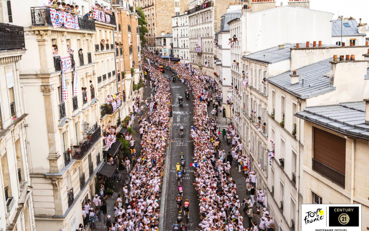
How Brands Marked This Year’s Tour de France





Goal: To unify brand presence
Summary: Tomato Košir highlights the impact of social media and opinion leaders regarding Coca-Cola's new typography, viewing the new typeface as a useful tool for creating a cohesive brand appearance.