Welcome to the automated Brand Tracker diaries.
Apple Music Revamps Visual Identity Inspired by Sound Waves
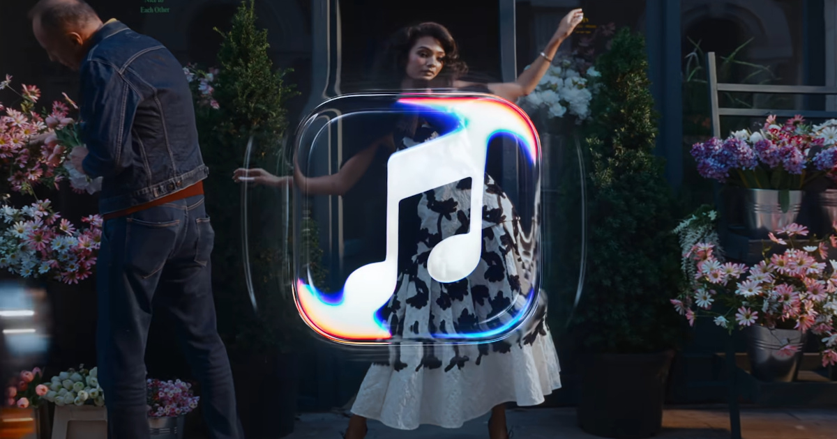
Goal: To strengthen brand personality through a direct link between sound and image
Claim: Null
Media: Streaming service content, event programming, advertising campaigns
Summary: Apple Music has introduced a new visual identity inspired by the vibrations of music, aiming to enhance the brand's personality by connecting sound with imagery. The project was developed by TBWAMedia Arts Lab in collaboration with music producer Fred Again and sound design company Nest Acoustics. The visual identity is based on transforming music into images by creating waves in mineral oil. The update includes a new logo and audiovisual signature to reflect the energy and dynamism of music, set to feature in original content, events, and advertising campaigns.
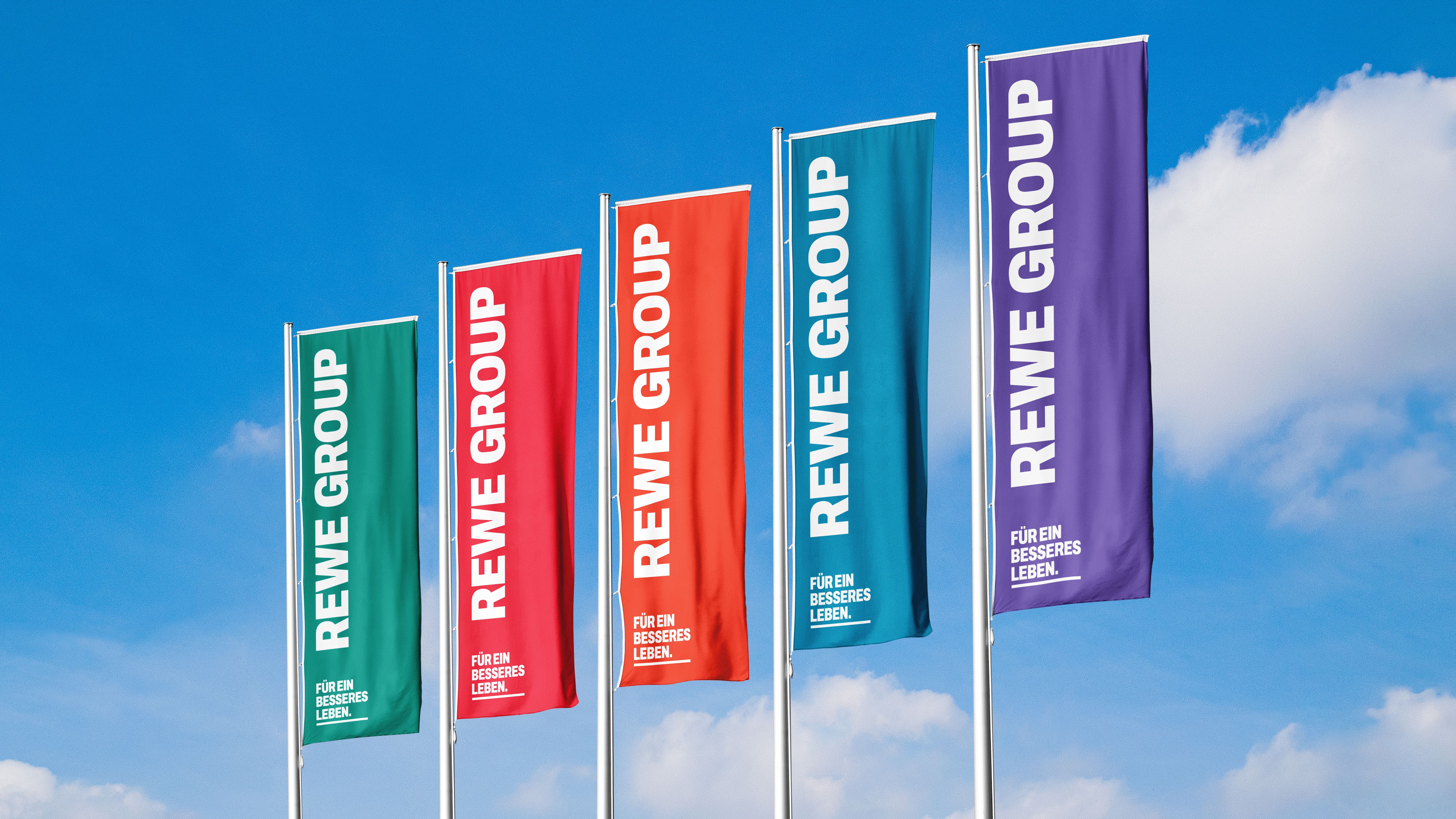
Billa-Mother: New Colors, New Balance: This is how the Rewe Group will look in the future
Source: https://www.horizont.at/marketing/news/rewe-international-noch-mehr-gemeinsam-103603
Goal: To refresh the brand image of Rewe Group
Claim: A new look for a better balance
Summary: The Rewe Group is introducing new colors and a new balance in their branding to update the image of their subsidiary Billa. This initiative reflects a broader strategy to enhance brand identity and consumer engagement.
GBFoods Italy chooses Arc’s after competition for the in-store launch of the 100% natural Saikebon recipe
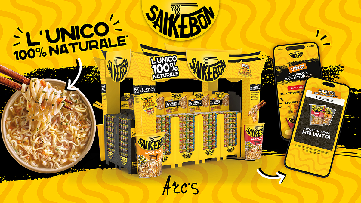
Goal: To enhance in-store presence with a new visual identity
Claim: The only 100% natural
Media: In-store display, digital platform for the contest
Summary: Saikebon is renewing its in-store presence with the launch of a new 100% natural recipe, developed by Arc’s for GBFoods Italy. The campaign involves adapting the global key visual for the Italian market and redesigning POS assets and display structures. The main claim emphasizes the product's unique position in the instant noodles segment, while the new visual identity aims to make the product stand out on the shelves. The project also includes consumer activation to support drive-to-shelf efforts.
Benjamin Simon and Dirk Schuster: Technical Skill is the Foundation. Taste Makes the Difference
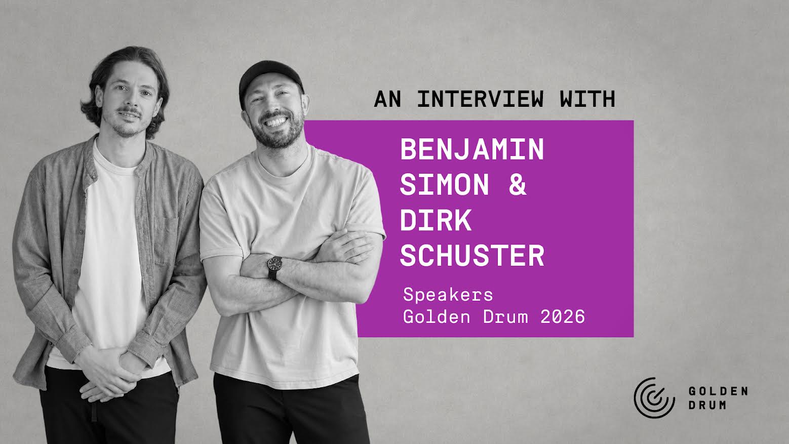
Goal: To create a distinct visual identity for Xbox Design Lab.
Claim: Technical skill is the foundation; taste makes the difference.
Media: Visual content in various formats
Summary: Benjamin Simon and Dirk Schuster, co-founders of the studio FOREAL, discuss the importance of a recognizable creative identity in a visually saturated industry. They highlight their success with the Xbox Design Lab Originals campaign, which won seven Cannes Lions, including the Grand Prix for Creative eCommerce. They emphasize the need for ongoing creative evolution while maintaining their distinctive style and identity.
New: Gut Design Buenos Aires developed the new visual identity of arteba together with Urban Grupo
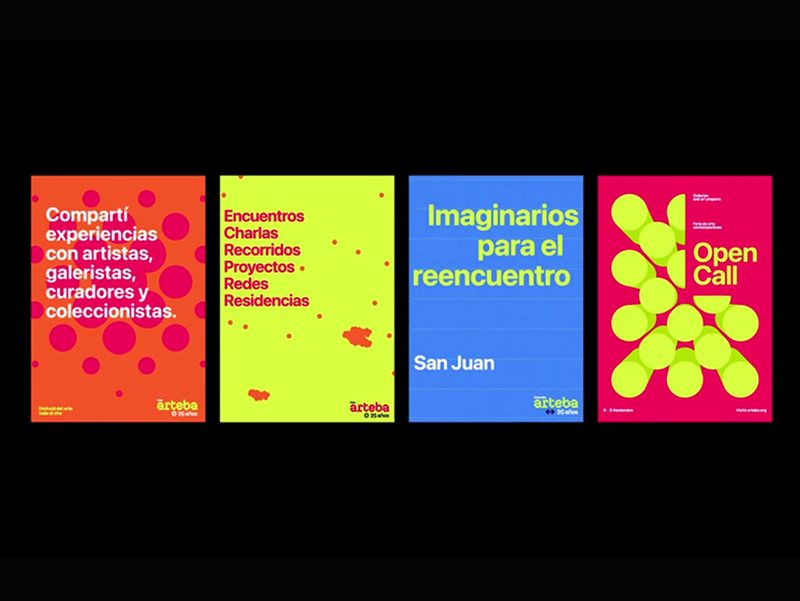
Goal: To represent a visual identity for a year-round institution connecting various art community members
Summary: As part of its 35th anniversary, arteba is renewing its visual identity with the help of Gut Design Buenos Aires and under the strategic direction of Urban Grupo. The new identity reflects the vibrant spirit of Latin America and is designed to grow with the institution, encompassing various initiatives and maintaining a flexible, bold, and contemporary visual system.
Instagram Updates Wordmark for the First Time in Ten Years

Source: https://www.imagensdemarca.pt/artigo/instagram-renova-o-wordmark-pela-primeira-vez-em-dez-anos/
Goal: Modernize the brand's visual identity
Media: Social media, mobile application, marketing materials
Summary: Instagram has updated its wordmark for the first time in ten years to modernize its visual identity while maintaining recognizable elements. The new design combines cursive writing with conventional typography, resulting in a more compact and visually striking wordmark. The platform is also reducing its dependence on traditional gradients and creating a visual language that highlights community-generated content. The updated wordmark will be gradually rolled out globally through 2026 and beyond.
Tbwa New Visual Identity that Summarizes the Community of the Network
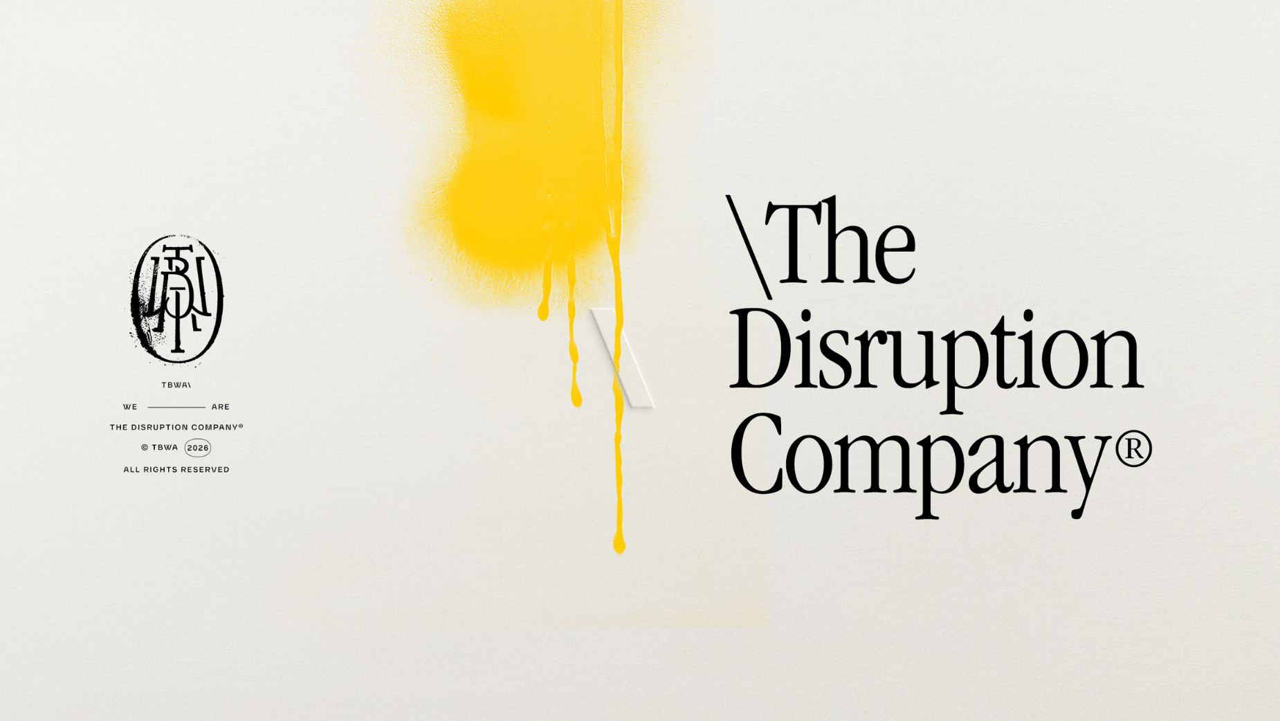
Goal: To create a distinctive visual language for immediate brand recognition
Claim: A great design that people can see and feel
Summary: Tbwa has launched a new visual identity designed by its internal unit DXD, emphasizing what is termed the 'Visual brand soul' to help audiences recognize the brand at first glance. The update introduces new visual elements, including hand-drawn iconography and a new color called Analog, alongside a characteristic Serif font. The design aims to balance global coherence with local relevance, allowing agencies to adapt the system for their markets.
TBWA Launches New Global Visual Identity with Craftsmanship
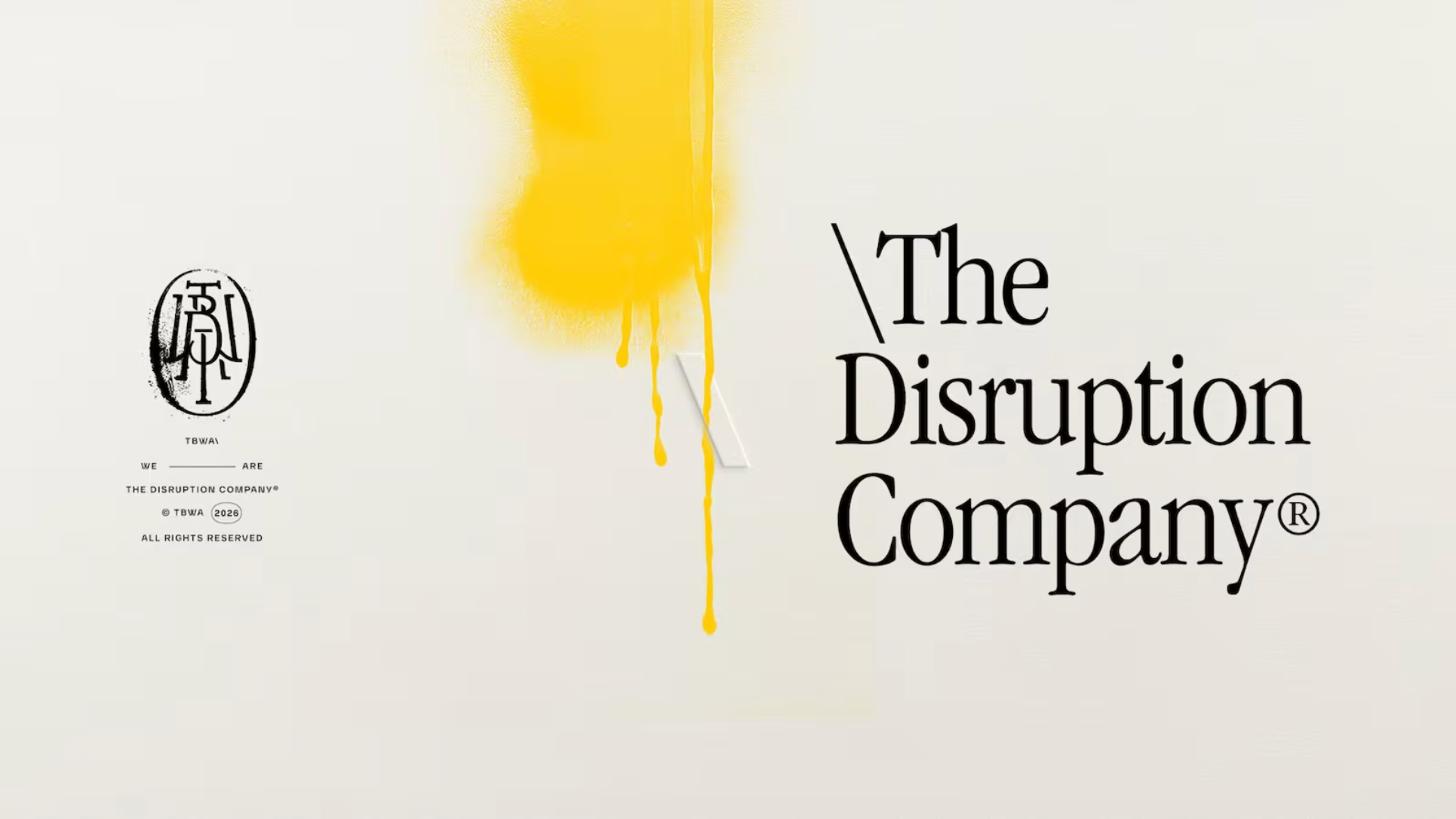
Goal: To present a new adaptable visual identity emphasizing human craftsmanship amidst increasing AI integration.
Summary: TBWA has launched a new global visual identity designed to adapt to various local markets. The updated identity features handmade expressions, new typography, and a broader color palette, intending to highlight human-centric creativity in an era of growing AI integration within the creative industry. The redesign includes a return to serif typography and emphasizes a more spontaneous visual language, moving away from overly staged portraits to a more authentic and lively imagery. The new identity allows regional offices to customize elements for local markets, bridging TBWA's historical ethos with modern design elements.
TBWA Renews Its Global Visual Identity, Emphasizing the Human Touch
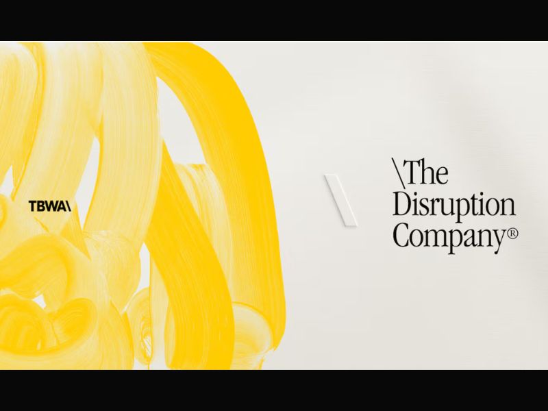
Goal: To unify the agency's visual identity across all offices while allowing regional flexibility.
Claim: Building visual systems that are so distinctive that people recognize the brand even before seeing its logo.
Summary: TBWA has unveiled a renewed global visual identity created by its internal design consultancy DXD, emphasizing craftsmanship and human-centered creativity in the AI era. The rebranding features a serif font return, a redesigned monogram, an expanded color palette, and incorporates hand-drawn symbols, textures, and handwritten elements to highlight human artistry. The visual identity also aims to reflect the agency's 'pirate' philosophy through custom illustrations and flexible branding.
TBWA unveils new global visual identity
Source: https://www.marketing-interactive.com/tbwa-unveils-new-global-visual-identity
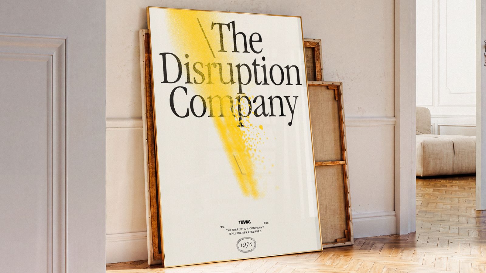
Goal: To create a distinctive visual language for brand recognition.
Claim: Building a brand's 'Visual brand soul.'
Summary: TBWA has launched a new global visual identity through its Design by Disruption (DXD) unit, emphasizing a unique visual language aimed at enhancing brand recognition and consistency across its agency network. The refreshed identity incorporates handcrafted elements, a modular design approach, and a balance between global and local customization, while reinforcing TBWA's philosophy of challenging conventions.
Why would a recognisable brand like Coca-Cola need a refresh?
Source: https://www.marketing-interactive.com/why-would-a-recognisable-brand-like-coca-cola-need-a-refresh
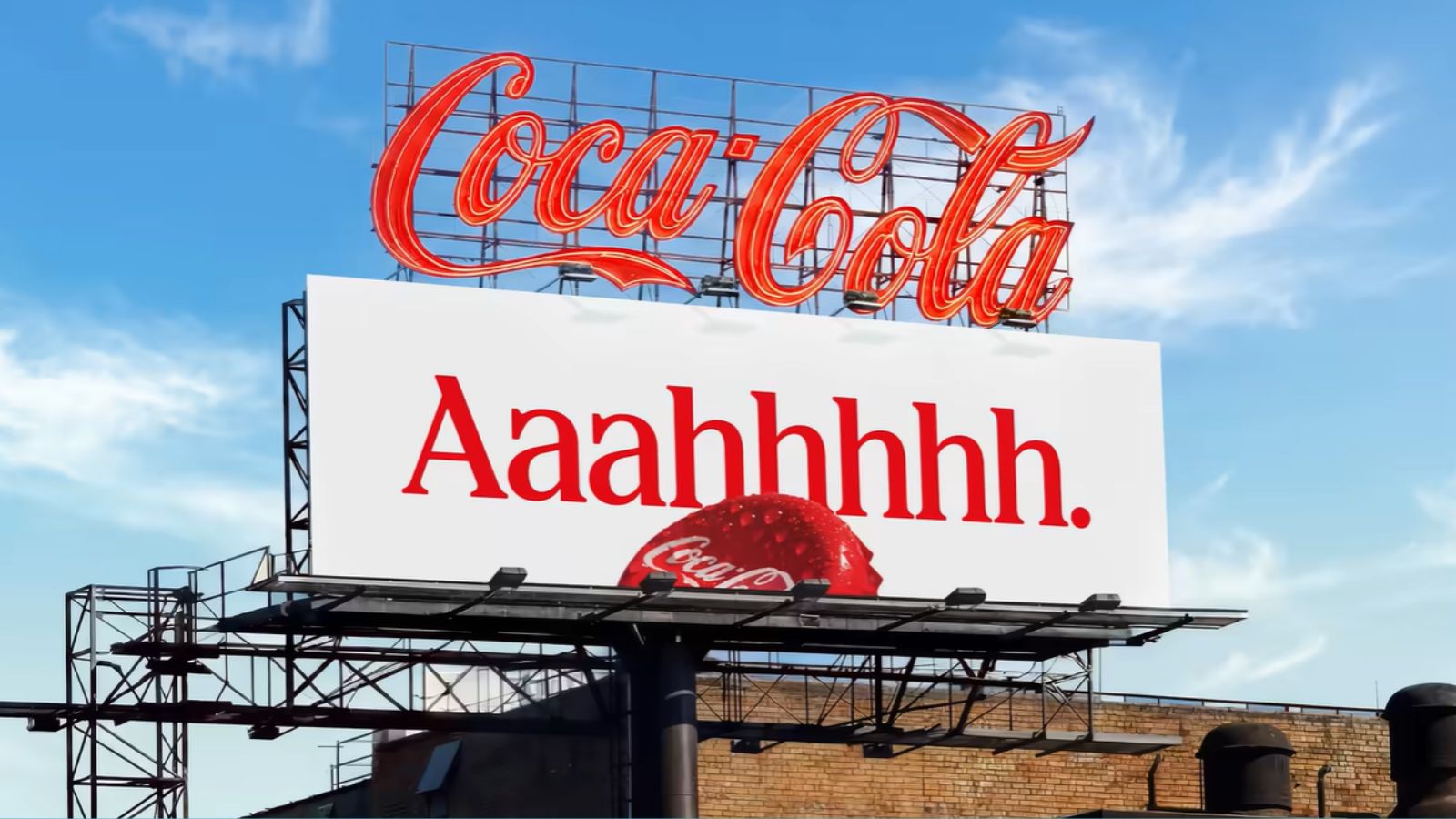
Goal: Ensure brand consistency across various markets
Claim: One recognisable brand experience
Summary: Coca-Cola has introduced a global visual identity refresh aimed at creating a clearer and more consistent brand experience across over 200 markets. This subtle update reinforces the brand’s core elements rather than reinventing them, highlighting the importance of maintaining brand equity in a competitive landscape.
Coca-Cola reinforces global visual identity with new image for over 200 markets
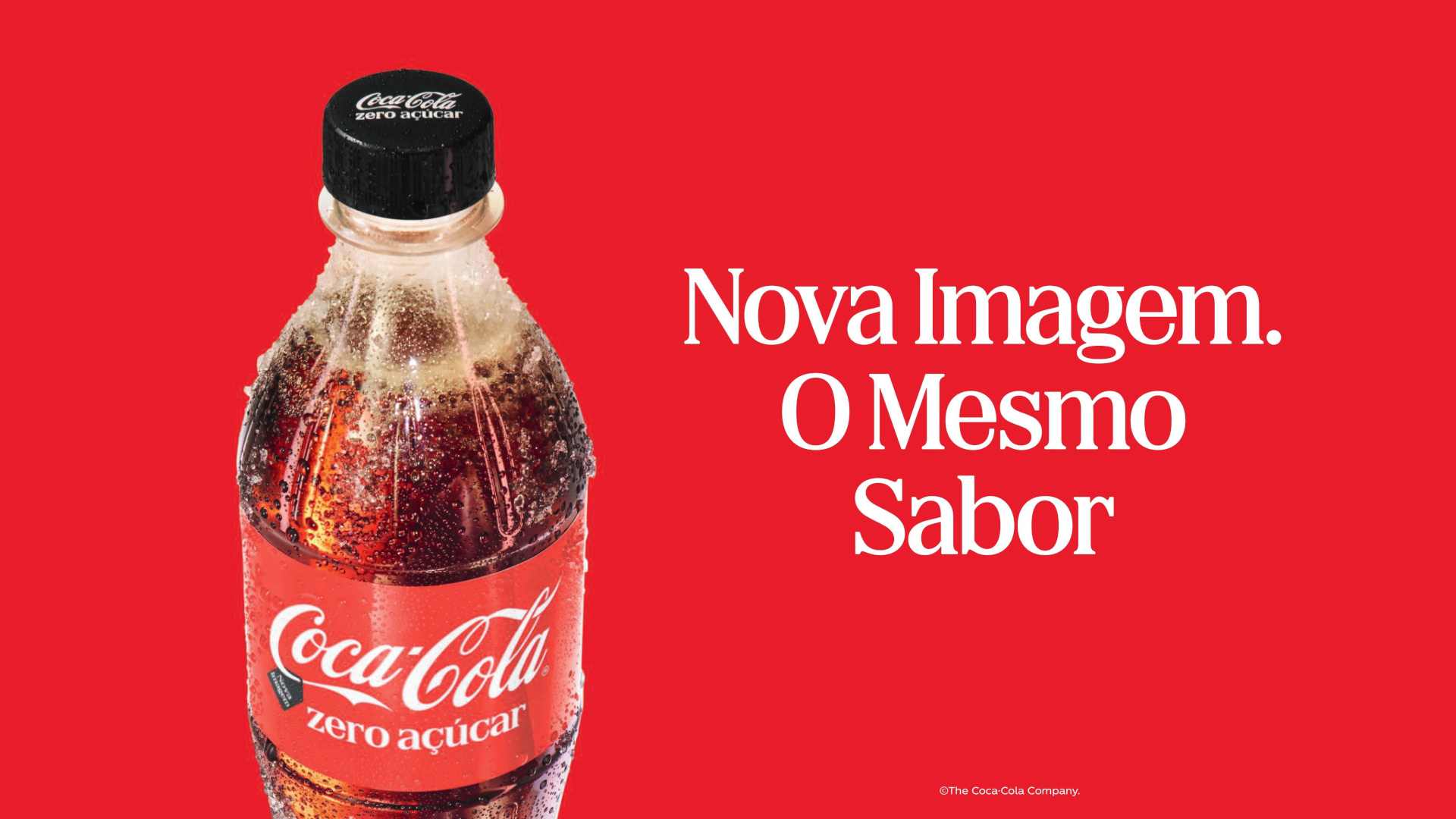
Goal: To create a consistent visual identity across all consumer touchpoints
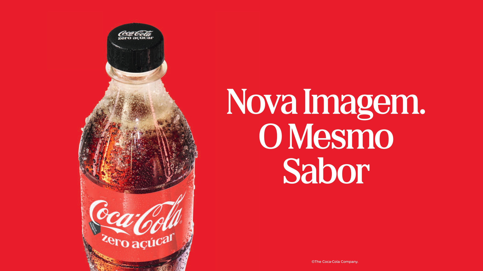
Claim: New Image. The Same Flavor
Media: Digital platforms, packaging, retail
Summary: Coca-Cola is implementing a new global visual identity system to reinforce iconic brand elements and create a more consistent consumer experience across more than 200 markets, including Portugal. The campaign titled 'New Image. The Same Flavor' aims for every expression of the brand to be instantly recognizable as Coca-Cola. The transition will occur gradually, allowing the old and new designs to coexist temporarily as the products are distributed. A new Brand Center and design tools have been developed to support this implementation, with creative collaboration from multiple agencies.
The Globe and Mail Creates a System for Various Themes from Its Headline
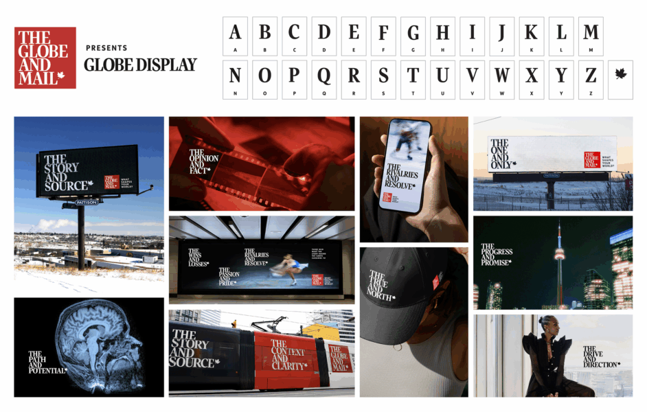
Goal: To adapt the existing brand identity for a digital audience
Media: Television, outdoor advertising, print, digital channels, audio formats
Summary: The Globe and Mail, a Canadian newspaper, is utilizing its headline as a flexible visual system that can change based on ad themes. The campaign 'What Shapes Your World?' developed by VML Canada modifies the original headline structure while keeping it recognizable. It was launched in March 2026 with various adaptations across multiple media platforms to connect with a digital audience.
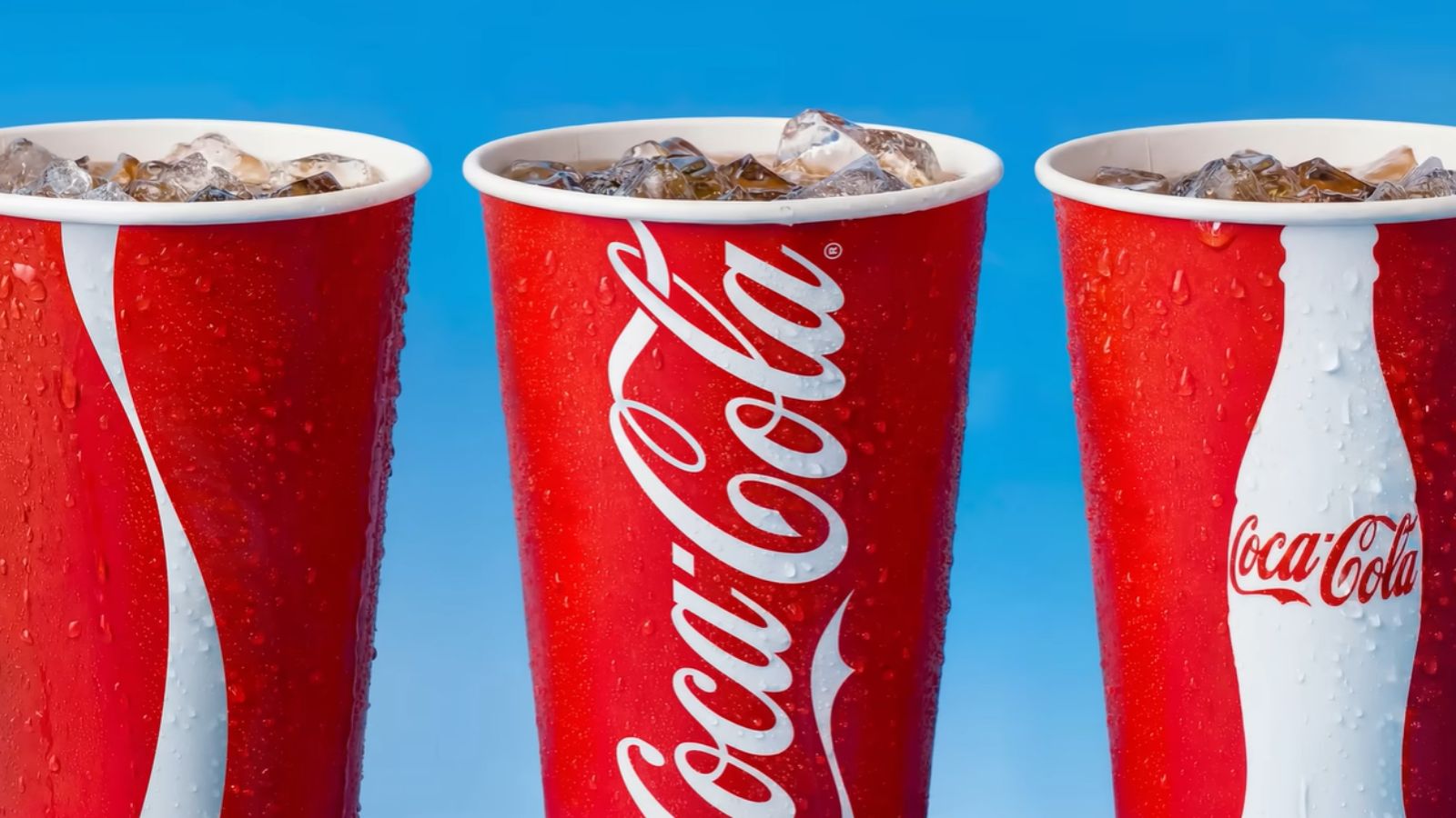
Coca-Cola refreshes its look without rewriting the recipe







Source: https://www.marketing-interactive.com/coca-cola-refreshes-its-look-without-rewriting-the-recipe
Goal: To create greater consistency across marketing and packaging
Claim: Coca-Cola is one of the most recognised brands in the world
Media: Digital touchpoints, packaging, retail environments
Summary: Coca-Cola has introduced a new global visual identity system to enhance consistency across its marketing and packaging in over 200 markets. The refresh emphasizes the brand's core visual elements and includes updates to Coca-Cola zero sugar packaging. A new immersive brand center and AI-powered design tools will support the rollout, aiming to ensure brand governance and consistency.
Coca-Cola Changes Its Visual Image Worldwide (and the Cans and Bottles You Buy in Uruguay Will Look Different)
Goal: To make Coca-Cola products unmistakably recognizable worldwide
Claim: Coca-Cola is one of the most recognized brands in the world
Media: Digital experiences, packaging
Summary: The Coca-Cola Company launched a global visual identity refresh that is being rolled out in Latin America, including Uruguay, enhancing the iconic red and white palette, emphasizing its historic Spencerian typography, and introducing more prominent branding for Coca-Cola Zero Sugar. The aim is to ensure consistency and clarity in the brand's appearance across over 200 markets.