Welcome to the automated Brand Tracker diaries.
Quit reveals biggest rebrand in 40 years as Australia’s nicotine landscape evolves
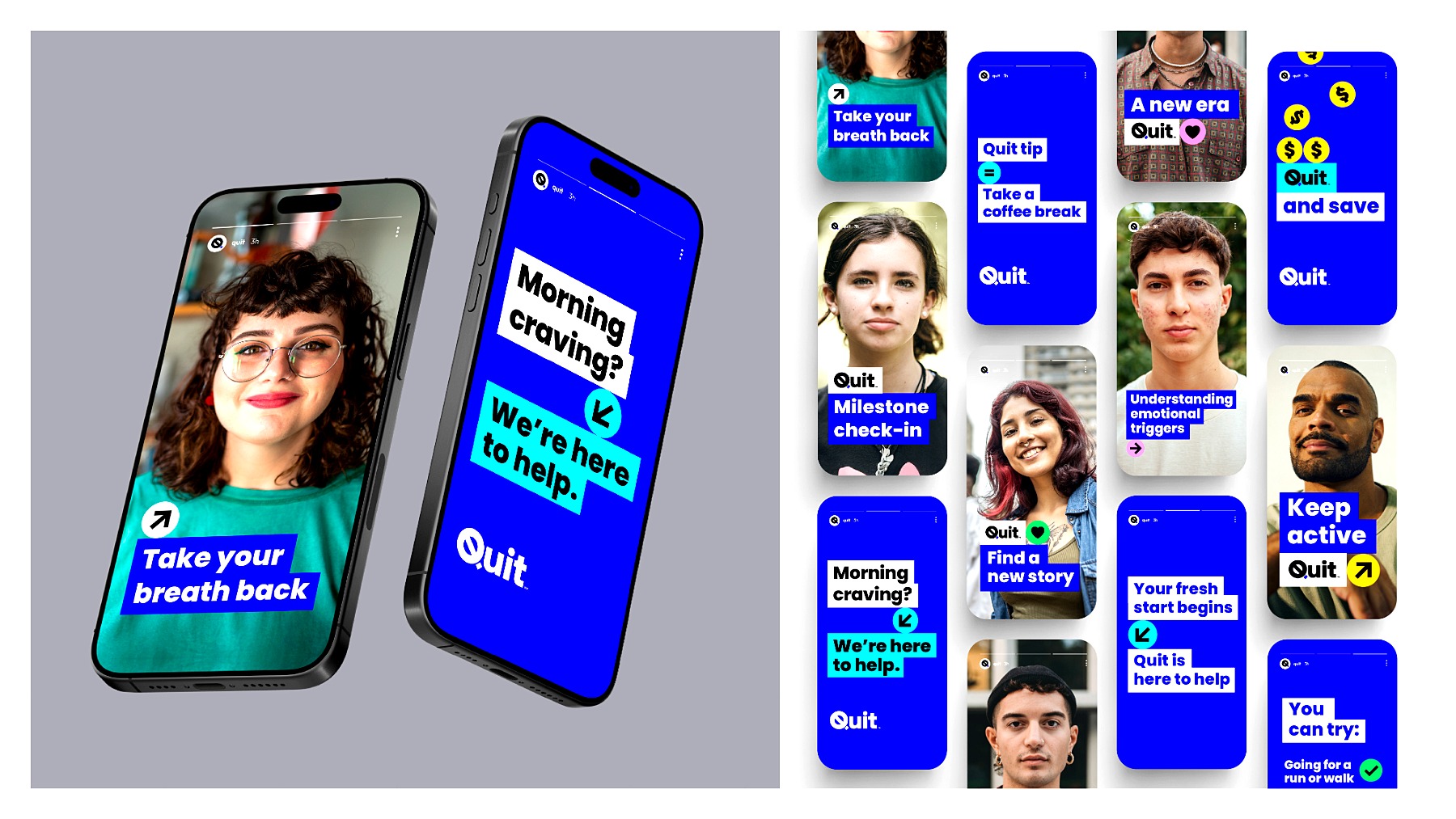
Goal: To reposition Quit for a new nicotine landscape
Claim: Adapting to nicotine’s new frontier
Summary: Quit, an anti-smoking organization, has undergone its biggest rebrand in over 40 years to address the shifting nicotine landscape marked by the rise of vaping and nicotine pouches. The rebrand, developed by Nature and Studio Binocular, aims to maintain recognition of its established identity while appealing to a new generation. The changes reflect Quit's transition from a state program to a national cessation organization.
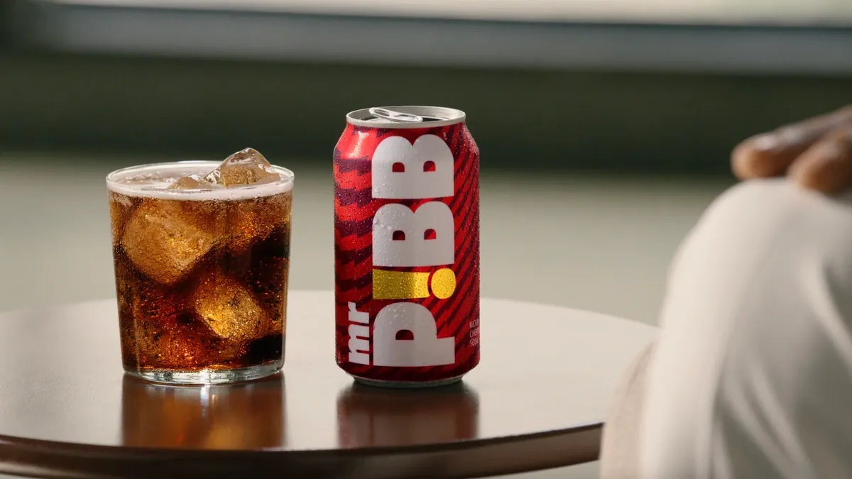
How Coca-Cola’s Mr. Pibb became the fastest-growing brand of 2026
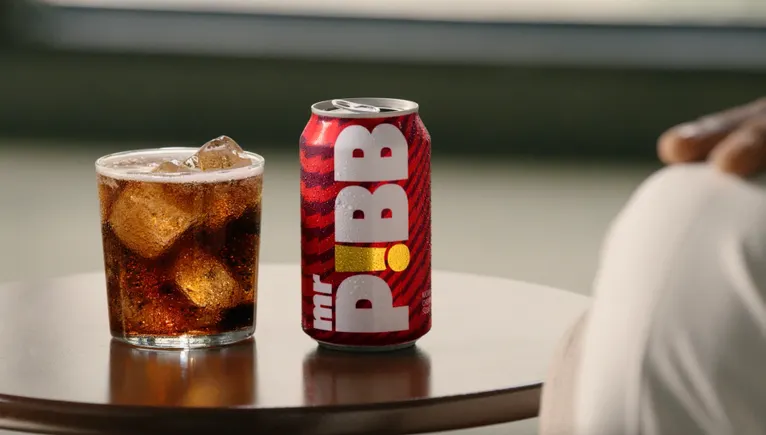
Goal: Increase brand awareness and consumer trial
Claim: Fastest-growing brand of 2026
Media: Promotional events, sampling, social media
Summary: Coca-Cola's Mr. Pibb has experienced significant growth since its relaunch, becoming the fastest-growing brand of 2026 with over 20% volume growth in Q2. The relaunch strategy focused on targeting 'zillennial' consumers through a campaign centered on basketball culture, and plans for future product extensions, including the Mr. Pibb Black-Current flavor, are underway.
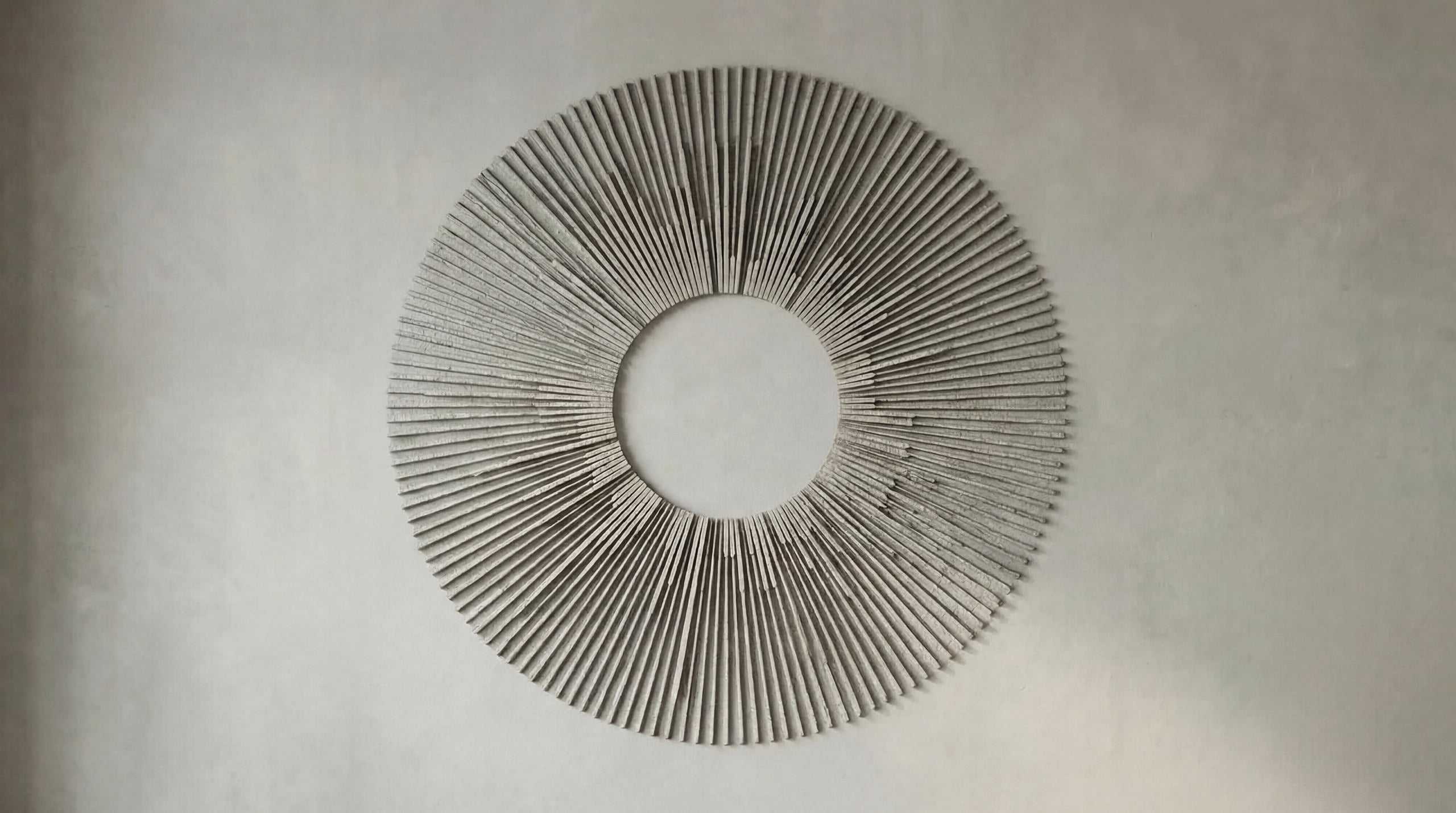
From a winning idea: Span’s identity never sleeps
Source: https://www.media-marketing.com/tema-dana/iza-pobjednicke-ideje-spanov-identitet-nikada-ne-miruje/
Goal: To showcase the value of Span's continuous work in a rebranding effort.
Media: Corporate website and Intranet
Summary: Span, a leading Croatian IT company, has launched a rebranding campaign titled 'Identity that never sleeps' to highlight the often unseen value of its continuous operations in IT support and cybersecurity. The centerpiece of this new visual identity is Priority Star, a real-time data visualization that reflects the company's 24/7 operational rhythm. This campaign aims to show clients the company's readiness to adapt to contemporary challenges and its commitment to providing uninterrupted support.
Here is the people’s merciless Nora verdict
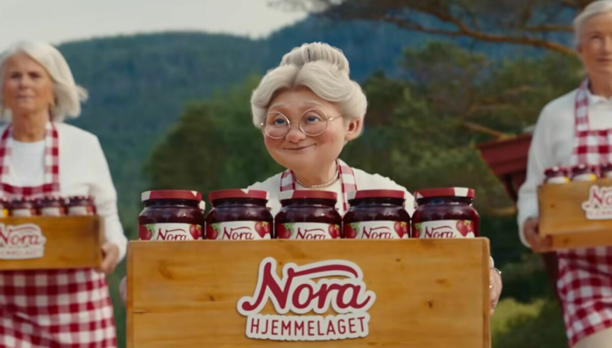
Source: https://www.kampanje.com/premium/her-er-folkets-nadelose-nora-dom/1031283
Goal: To transition the Nora brand to Stabburet
Media: advertisement film, social media, surveys
Summary: Orkla's decision to rebrand the Nora food line under the Stabburet name has sparked significant debate. A recent advertising campaign features a narrative where the character Nora marries Stabburet, which has drawn criticism for its portrayal. Opinion surveys indicate that 65% of respondents prefer the old Nora label over the new Stabburet design, underscoring the challenges faced during branding changes.
Rebranding: This is the new brand appearance of GMX

Source: https://www.horizont.at/medien/news/rebranding-das-ist-der-neue-markenauftritt-von-gmx-103587
Goal: To launch a new brand appearance
Summary: GMX has introduced a new brand appearance as part of its rebranding efforts. The new identity aims to modernize the company's image and align it with the evolving expectations of its users.
Special Feature on ‘Proposals from Creators Leading Successful Rebranding’
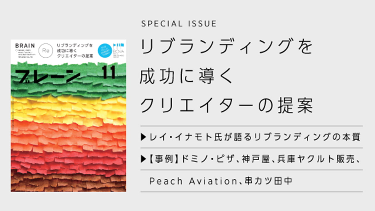
Source: https://www.advertimes.com/20260930/article559350/
Goal: To enhance customer experience and emphasize the taste of pizza
Summary: Domino's Pizza Japan is set to undertake a major rebranding by summer 2026, moving away from price promotions like 'half-price takeout' to a focus on the inherent taste of pizza and customer experience values. This announcement is part of a global rebranding effort, tailored to suit the Japanese market.
We want to introduce the new image, but Cofidis maintains its entire identity
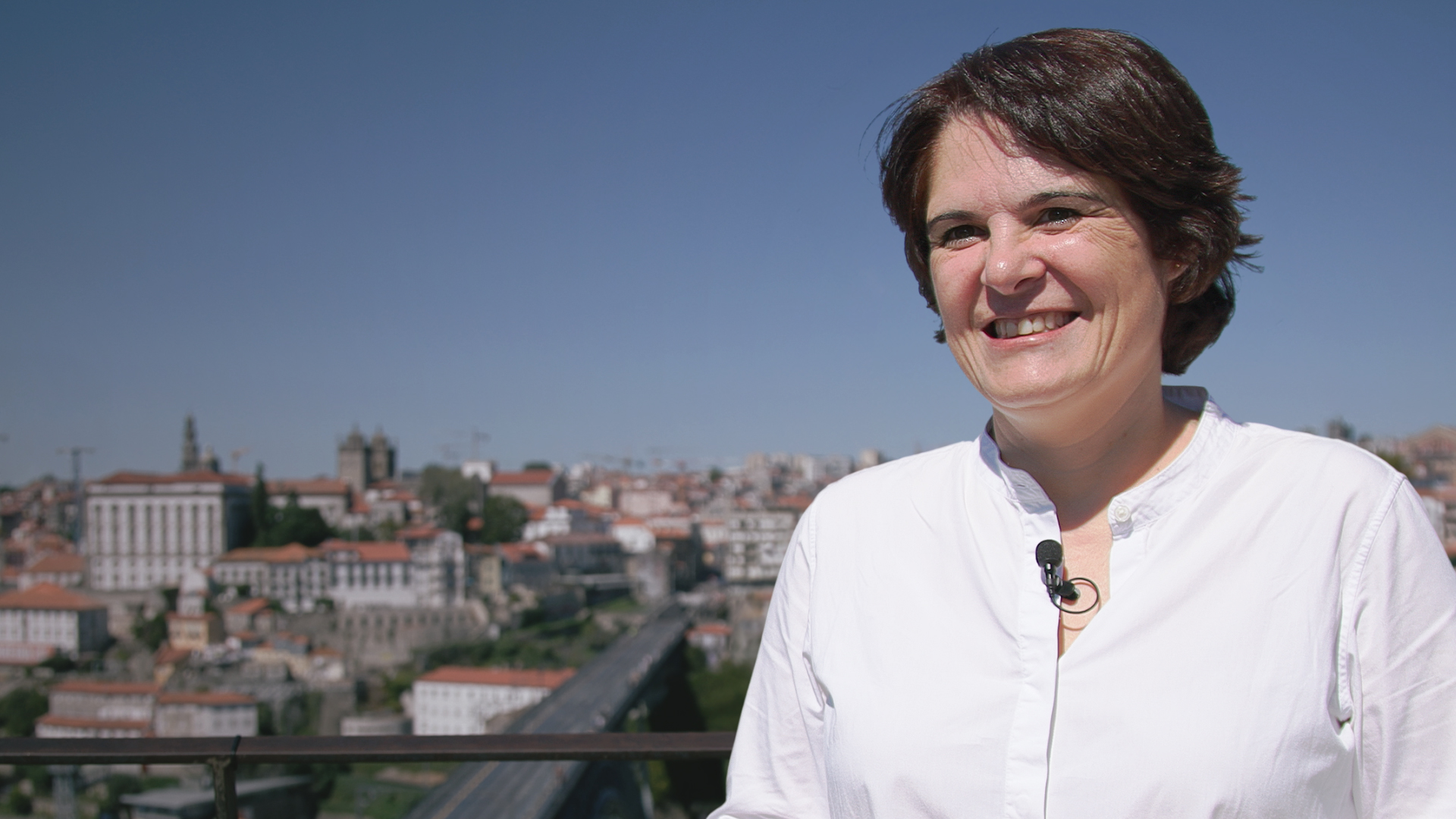
Goal: To modernize the brand image while preserving its core identity and values
Claim: From people for people
Summary: Cofidis marks 30 years in Portugal with a new campaign that introduces a rebranding aimed at modernization without losing its identity. The new visual identity reflects the evolution of consumers and the market, emphasizing the brand's commitment to maintaining close relationships with customers. Celebrating its three-decade presence, Cofidis looks ahead with optimism, ensuring it stays true to its roots while evolving.
FRISKIES marks over 35 years in Portugal with rebranding and new campaign led by consumers…

Goal: To enhance communication and highlight real pet owners' testimonials.
Claim: Quality nutrition without compromises.
Media: television, connected TV, social media, billboards
Summary: FRISKIES, a brand of Purina with over 35 years in the Portuguese market, launches the 'Meu FRISKIES' campaign as part of its recent rebranding. The campaign focuses on real pet owners, using a 'selfie' format to share why they choose FRISKIES, aiming to connect authentically with families. The initiative seeks to democratize access to quality nutrition for pets while reinforcing the brand's role in daily family routines.
Oscar Health Is Rebranding to Make Healthcare Feel Human
Goal: To empower consumers in choosing health insurance options.
Claim: Made for Real Life
Summary: Oscar Health has rebranded to enhance consumer choice in health insurance with the introduction of a retail platform called Lucie, aimed at simplifying the selection process. The company's mission remains focused on empowering individuals to confidently make their own healthcare decisions. Their campaign, 'Made for Real Life', highlights the authentic experiences of real members rather than traditional industry imagery.
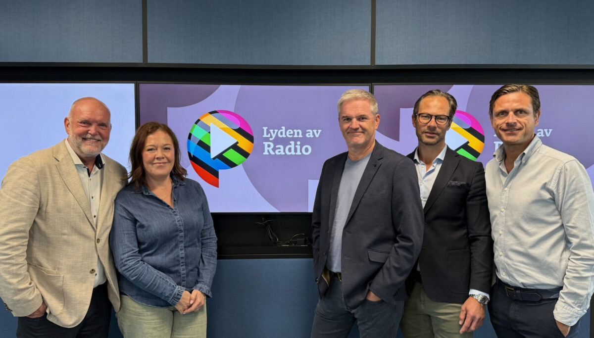
P4-group becomes ‘The Sound of Radio’
Source: https://www.kampanje.com/premium/p4-gruppen-bytter-slagord/1026978
Goal: To simplify digital listening and strengthen the connection between the channels while preserving their individuality.
Claim: The Sound of Radio
Media: Website, app, various platforms
Summary: The P4-group rebranded from 'The Sound of Norway' to 'The Sound of Radio' as part of a new identity shift that aims to improve digital listening experiences. This change includes visual updates to logos and a new design and branding system that enhances recognition across different products and platforms. The goal is to better connect the channels while maintaining their unique characteristics, accommodating digital listening trends.
AdKaora Transforms Identity with Dude Design and Emphasizes ‘Breathing Innovation’
Goal: To create a new brand identity that reflects human intuition and technology.
Claim: Breathing Innovation
Summary: AdKaora has undergone a rebranding process led by Dude Design to usher in a new phase for the MarTech agency under Mondadori Digital. The rebrand emphasizes a vision where human intuition works in harmony with technology, reflected in the new slogan 'Breathing Innovation'. This shift follows recent expansions and mergers, aiming to unify diverse capabilities under a single identity. The new visual identity juxtaposes human and technological elements, denoting a living, adaptable technology. AdKaora now focuses on a full-funnel model encompassing brand awareness, lead generation, and conversion, driven by new marketing technologies.
Interview: CMO Kerri Holmes on Marsh’s rebrand as a resilience play
Source: https://campaignme.com/interview-cmo-kerri-holmes-on-marshs-rebrand-as-a-resilience-play/
Goal: To clarify Marsh's role and value in a complex market.
Summary: Marsh has undergone a significant rebranding process that focuses not just on appearance but on meaning and clarity of its services. CMO Kerri Holmes emphasizes that the rebrand aims to help clients better understand the company's offerings and enhance its relevance in the rapidly changing Middle Eastern market. The transformation seeks to position Marsh as a partner that provides practical support and foresight amidst complexity and uncertainty.
Coca-Cola Changes Design and Introduces 200ml Packaging
Goal: To create a unified and modern visual system that is instantly recognizable across various markets and formats.
Claim: Coca-Cola remains a part of culture, fashion, music, and shared memories.
Summary: Coca-Cola introduces a new vibrant visual style while maintaining its iconic taste. The redesign emphasizes the brand's strong symbols and aims for a cohesive visual identity across products. Along with this, a new 200ml package is launched in the Czech market to cater to the demand for more practical sizes. The campaign also includes a contest leading customers to significant Coca-Cola locations, with a limited series of T-shirts designed by illustrator Barbora Balgová to reflect the emotions associated with the brand.
SYFY changes its name to SciFi starting in October in Portugal

Source: https://www.imagensdemarca.pt/artigo/syfy-muda-de-nome-para-scifi-a-partir-de-outubro-em-portugal/
Goal: Align the brand with other European markets while maintaining loyal content.
Claim: The rebranding of SYFY to SciFi is a natural evolution of the channel.
Media: Television, Events
Summary: SYFY is changing its name to SciFi in Portugal starting October 1, supported by a new visual identity. This change, announced by NBCUniversal International Networks & Direct-to-Consumer, aims to align the Portuguese brand with other European markets. The channel will continue to focus on science fiction, fantasy, and genre entertainment, unveiling a fall programming lineup with several premieres including new series and seasonal specials.
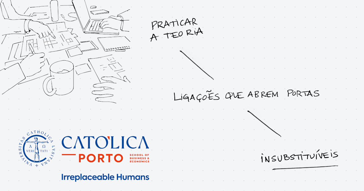
Católica Porto School of Business and Economics changes its name and launches campaign on the irreplaceable role of humans
Goal: Highlight the importance of human skills in the age of AI
Claim: Irreplaceable Humans
Media: Television, digital, press, outdoor
Summary: The Católica Porto School of Business and Economics has undergone a rebranding, adopting the new identity and positioning 'Irreplaceable Humans', which emphasizes the role of human skills in the era of artificial intelligence. The campaign aims to showcase the irreplaceable qualities such as critical thinking, creativity, ethics, empathy, and collaboration amidst technological advancements. The rebranding resulted from a strategic review and included feedback from various stakeholders. The campaign will run across television, digital platforms, press, and outdoor advertising.
Genesis builds a new identity around life, not energy after merging three brands
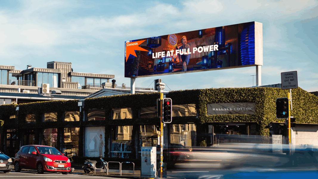
Goal: To change the perception of energy management and improve customer experience
Claim: Better control over energy allows people to lead everyday life according to their priorities
Media: Television, outdoor advertising, audio, digital, social channels
Summary: Genesis has rebranded by merging three previous brands and launched the campaign 'Life At Full Power', developed with agency Bastion Aotearoa. This campaign emphasizes energy management rather than consumption metrics, aiming to enhance customer experience through accessible and humorous storytelling across various media channels. New services like Power Shout and EVerywhere are introduced to empower customers with greater control over their energy use.
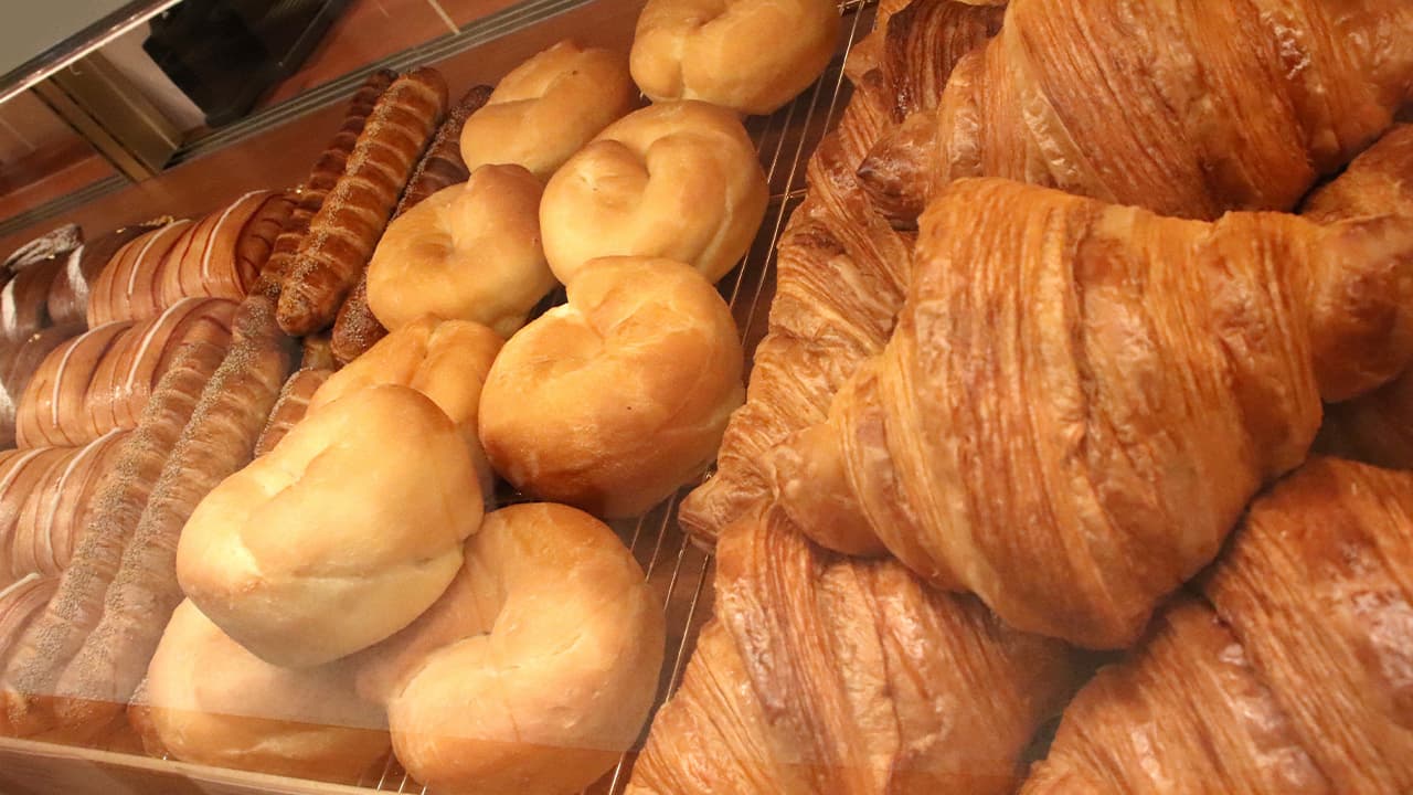
“I Apologized to Employees” But After All, Kobeya Let Go of 70% of Sales, A Major Rebranding by the Long-Established Bakery
Source: https://www.advertimes.com/20260819/article554238/
Goal: To rejuvenate the brand and connect with customers through a new brand statement
Claim: Be Playful
Summary: Kobeya is undergoing a major rebranding as it prepares to reopen the Kobeya Kitchen Atre Ebisu Store on August 20. This includes a new corporate logo, store design, and uniforms, aimed at shifting from product and quality differentiation to generating empathy through worldviews and experiences. The rebranding reflects the company's transition after selling off its packaging bread business, now focusing on frozen dough and direct management operations. The new brand statement emphasizes creating 'new commons in food' with the core slogan 'Be Playful', embodying a fresh and engaging approach to customer experience.
Rebranding: Häppy Reintroduces Vilsa Brand H2Obst
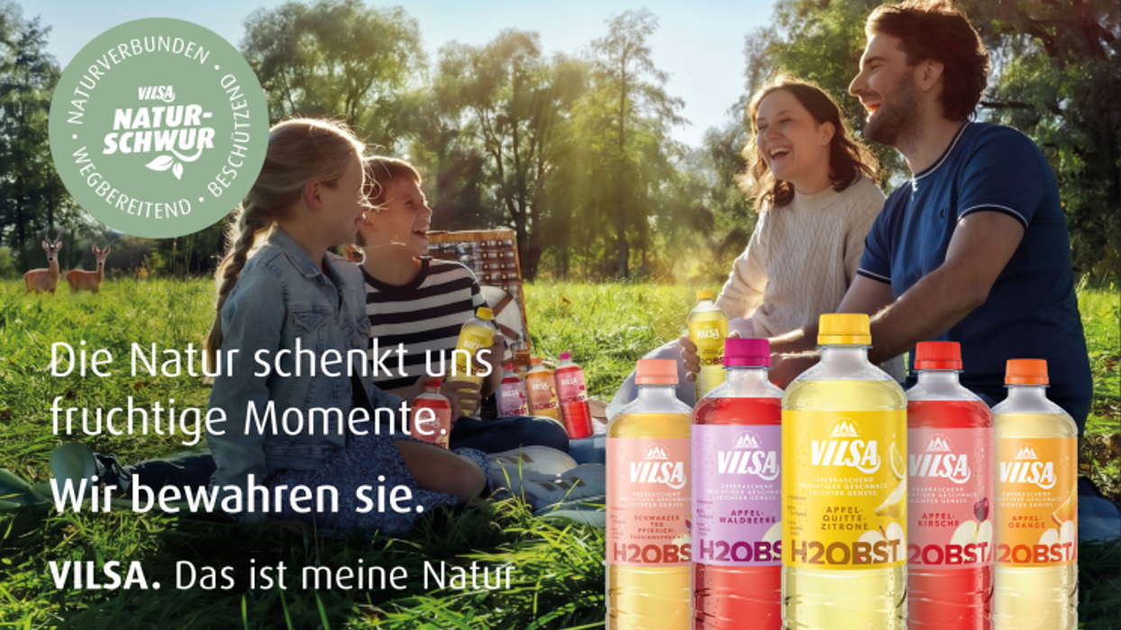
Goal: Rebranding the Vilsa brand
Summary: The article discusses the rebranding efforts for the Vilsa brand's H2Obst product by the agency Häppy, aiming to refresh its image and market presence.
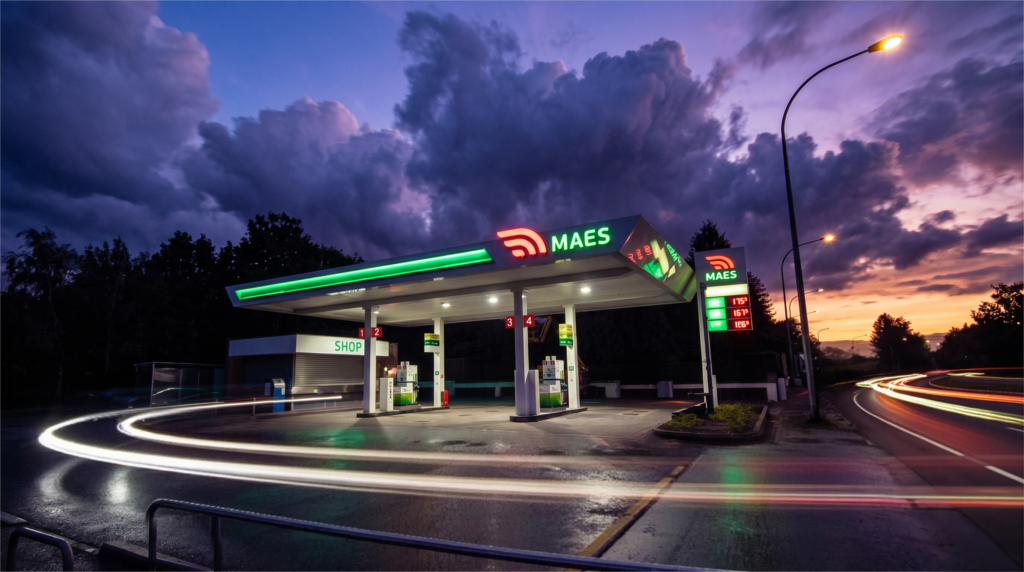
June20 undertakes the rebranding of Maes service stations
Source: https://pub.be/fr/june20-signe-le-rebranding-des-stations-service-maes/
Goal: To refresh the brand image of Maes service stations
Summary: The article discusses the rebranding efforts by June20 for Maes service stations, aiming to update and enhance the brand's visual identity and market presence.
The rebranding of BBC Belgium leads to strong audience growth

Source: https://pub.be/fr/le-rebranding-de-bbc-belgium-entraine-une-forte-croissance-daudience/
Goal: Increase audience
Summary: The rebranding of BBC Belgium has led to a significant increase in audience growth.
Sunquick Revamps Image and Invites to ‘Mix Your Way’ in New Campaign
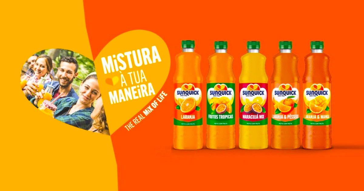






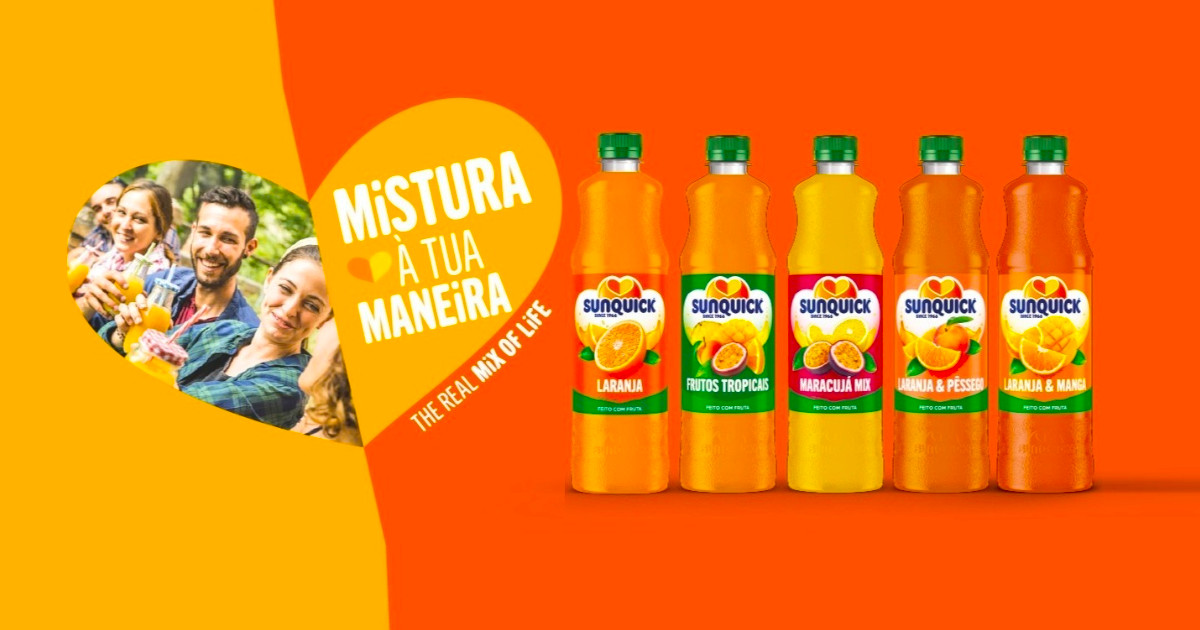
Goal: To inspire consumers to explore different ways of preparing and enjoying their drinks.
Claim: Mix Your Way
Summary: Sunquick is launching a rebranding campaign titled 'Mix Your Way', aimed at encouraging consumers to creatively prepare and enjoy their beverages. This initiative includes a renewed visual identity and aligns with the global platform 'The Real Mix of Life', celebrating daily moments and diverse experiences. The campaign seeks to expand consumption occasions and position Sunquick as a versatile option for various lifestyles while appealing to new generations of consumers.
NEWPRINCES RELAUNCHES GS, BRAND REVISED BY BEMARK

Goal: To reinforce direct retail presence and solidify consumer relationships.
Claim: A heritage worth celebrating, connecting memory and future.
Summary: NewPrinces has relaunched the GS brand with a new logo to enhance its presence in organized retail. This rebranding is part of a broader industrial strategy aiming to integrate production, logistics, and distribution. The new identity of GS maintains iconic elements while modernizing the image to resonate with both existing customers and new generations. The company plans to update its stores and strengthen its omnichannel services, staying true to its roots in the Italian distribution landscape.
For its 30th anniversary, MarkCom adopts a new identity and asserts its positioning as a federation of Consulting and Creation Agencies in Luxembourg
Goal: To assert its positioning as a federation of consulting and creation agencies
Summary: To celebrate its 30th anniversary, MarkCom has adopted a new identity that reaffirms its positioning as a federation of consulting and creative agencies in Luxembourg.
SWIO repositions itself and operates its rebranding with Lola
Source: https://www.adada.lu/2026/06/swio-se-repositionne-et-opere-son-rebranding-avec-lola/
Goal: repositioning the brand
Summary: SWIO is undergoing a rebranding effort in collaboration with the agency Lola, aiming to reposition its brand in the market.
Autocontrol considers that Verisure has made ‘exclusive tone advertising’ in its rebranding campaign
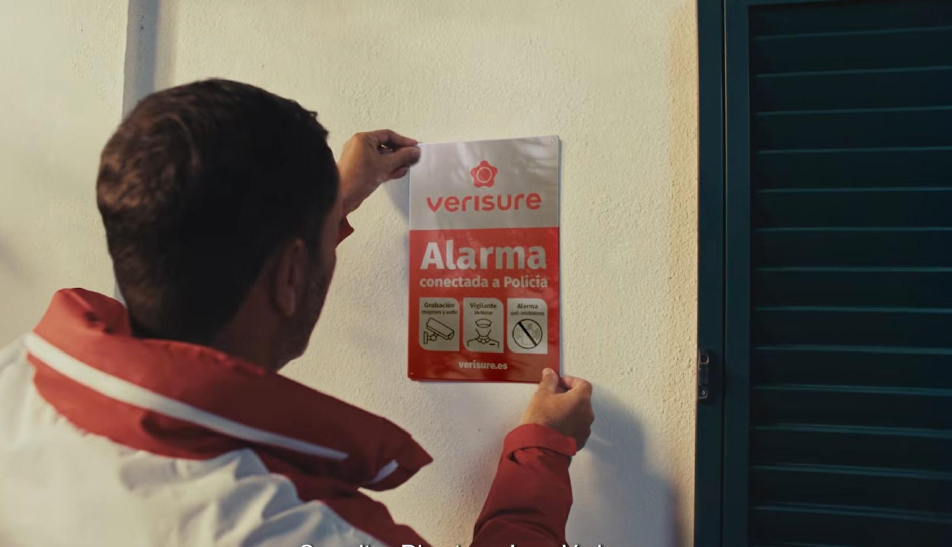
Goal: To promote the rebranding of the company
Summary: The advertising regulatory body Autocontrol has stated that Verisure's recent rebranding campaign features exclusivity in its messaging. Critics believe that while the campaign has strong points, they do not see value in investing in social media for promotional purposes.
More than a new logo: why Tinder’s rebranding is the best cultural marketing class of the year
Goal: To build an emotional and cultural relevance with users
Claim: From 'happily ever after' to 'happily to be determined'
Summary: Tinder has launched its first rebranding in nearly a decade, aiming to address user fatigue particularly among Generation Z. The rebranding focuses on creating a more relatable and narrative-driven identity through the introduction of a fictional columnist named 'T', moving away from corporate language to connect emotionally with a diverse audience.